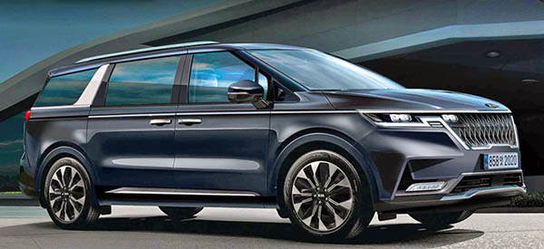
Another 2021 Kia Sedona illustration
Last Updated:
And let’s hope this is wrong.
Sure, it does match various spy shots and teasers.
But this looks like a mess.
The blend of a super square shape, lots of chrome trim and an overly aggressive front end looks
really cheap and quite vulgar.
I am not sure this is the best way for Kia to stand out. Or maybe that is where they are heading anyway. If the new 2021 Kia K7 sedan front end is any indication of their future designs, their future will not be subtle/classy designs…
This is an "overly aggressive" front end?? Not compared to many other wide obnoxious ugly grill front ends of late.
maybe reserve judgement until the real deal is announced???
After seeing the awkward satin chrome piece on the new Sorento's C-pillar, I have no doubt that the illustration is accurate. Kia and Hyundai are always trying to make their chrome accents stand out in a way that other auto manufacturers don't. At times, this is very much successful, for example the 1st gen Optima, and other's not so much.
Looks more like a Chinese design. Awkward lines and a total overuse of tacky chrome trim.
Dear Kia. Stop putting chrome dorsal fins on the C-Pillar.
Kia has released photos of the 2021 Kia Carnival, which is the Sedona here. And yes, it pretty much looks like that awkward illustration.
Lol, that was a good one. 🦈