2022 Honda Civic: let’s take a look inside!
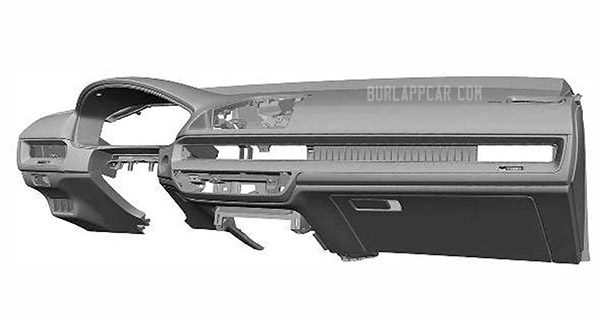
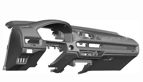
These are, again, just patent illustrations for the design of the next-generation Honda Civic.
So they are missing a lot of parts. Like screen, trim, etc…
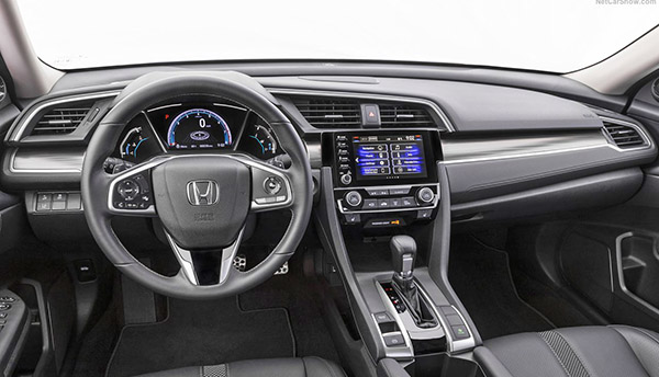
But they do give us an idea of the general shape. Which doesn’t seem more modern than the current model, really.
It does seem to have a more Mazda feel to it. The screen will be higher, and it seems, less integrated than it is now. More like the one in the Accord. So far, it actually does resemble a cross between the Accord and a Mazda.
I think the current Civic, inside and out, is still a great choice. From what we have seen of the exterior (HERE and HERE) the new generation seems to be much more conservative. And it looks like it will be the same thing inside.
The whole thing seems to be a big step backward…
But again, these grey patent illustrations are the worst way to discover a new car design… There might still be hope.


