BMW XM: production Vs. concept…
Last Updated:
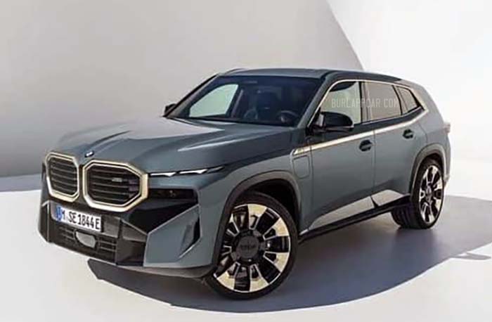
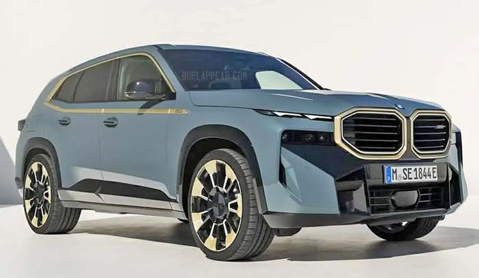
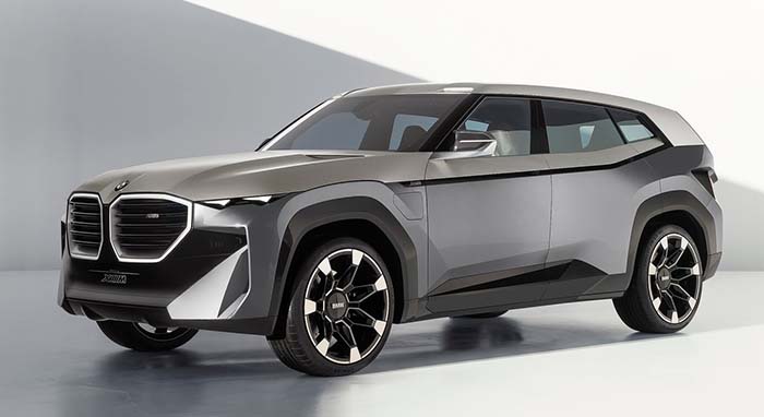
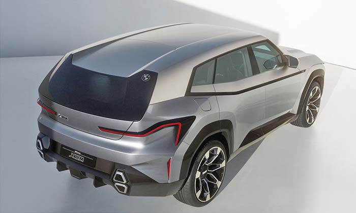
As we’ve seen before, the production version of the last year’s BMW XM concept looks very similar.
But is also quite different.
At first, they basically look the same.
Then you notice how much smaller the production grille is.
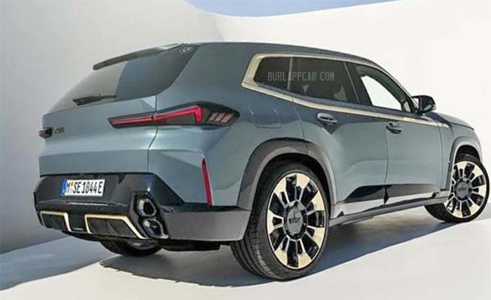
The overall design is also much more conventional. especially if you compare the front hood and fenders. The production door handles also look quite old-timey for such a modern car.
And the rear lights aren’t as modern as the ones on the concept. At all…
And of course, that gold trim is just awful. But that might just be specific to the version pictured above.
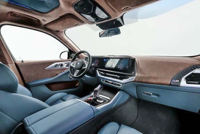
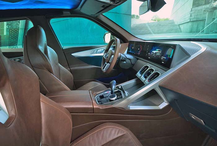
Inside, things are very different. Unfortunately. The concept’s interior was really nice and modern. While the production versions look like many other BMWs. (At least it’s not as horrific as the iX.)
More on the new XM soon. It will be powerful, fast, and very expensive…
Woah! That is way ugly… Uglier, I think, than the iX…. also way ugly.
That chrome below the beltline kicking up around the windows seems like such overkill and unnecessary clutter. In black on the concept it barely worked. Now it primarily looks like an attempt to "hide" how narrow the windows are. (kinda like the original Volt… masking the failure to translate the concept window/doors to production)
If this somehow landed in my driveway with my name on the title, I would immediately remove that chrome piece…. and also do something to simplify that grill.
If that whole front was black, I think it would look like Darth Vader… (and not in any good way)
On the other hand… the wheels look ok
A waste of money on total ugliness. Perhaps the Chinese mafia would love this POS.
That horrible face.
Big, angular, ugly.
Good Lord! Call the towns people. Tell them to bring the torches and pitchforks.