More pictures of the Rolls Royce Cullinan
Last Updated:
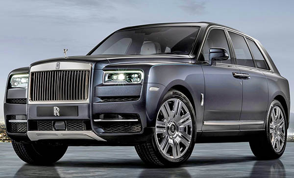
Still terrible, even in a more normal color.
That profile is just ridiculous, and looks like a box.
There is just zero design here…
It is just gross.
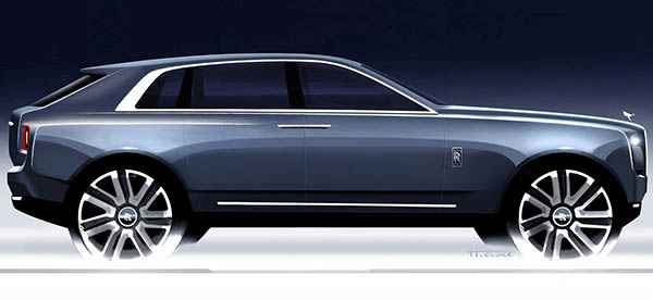
This is actually a really interesting official sketch. Showing, I guess, what they were going for in the first place.
Which wasn’t that bad!
What went so wrong between this and the production design???


I kind of disagree here, I think it looks just like a Rolls Royce should look, HORRIBLE.
Apparently the very rich like the "3rd world dictator" look. Will flags on the front fenders be the next hot styling trend?
It’s a lot thicker and greenhouse taller
I don't mind this at all. I think there is a lot more honesty than the Bentley. Still prefer a Range Rover.
DFcar, the problem is that it is not 1950 anymore, it's 2018. This thing is hideous.
Have you seen Rolls Royces lately? They're nothing but boxy so this fits right in.
The roofline should have remained flat; think RR Velar.
Though the sketch is more attractive, I don't find this that bad at all. The production photos are shot from a very low angle, which always distorts proportions somewhat. I don't know why they keep featuring photos like that.
Overall, it is much better than that bloated, awkward, ponderous Bentley.
I did have a laugh earlier, with the shot of the red one with the built-in seats on the back. That totally says "I'm too rich to let my butt touch the tailgate of my car." LOL
I don't think it's too ugly. At least it doesn't have excessive creases like many other SUVs. The main issue I have with it is that it doesn't feel very special.
The Range Rover looks much better.
Like the suicide doors! Looks really big and it can go off road with the best! Power is a V12. Price in the mid $300 as base price and rumor to top off in the $600K!
Ok.
I get the feeling that my opinion simply doesn't matter. Nor does anyone else's unless you can afford to buy one lol!
greenhouse got taller, but the most glaring difference is the length of the hood. look at the space between the front wheel well and door cut line on each, the longer hood on the sketch makes it a million times more elegant and less like a single brick shape.
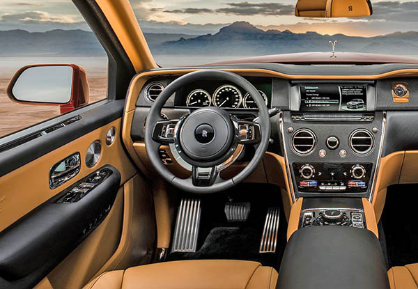
I don't think the exterior looks that bad. The interior, on the other hand, is weird, though perhaps it might look a little better in different colors.
I’m assuming since the BMW X8 was developed along side this monster, the bimmer might be more eye appealing assuming BMW used up all its “ugliness” on X7…
Vince, I hope you have seen this: https://jalopnik.com/heres-the-rolls-royce-canyonero-commercial-youve-all-be-1825960978 (I dont expect you to publish a Jalopnik link, but thought you'd enjoy it.)
Shift your mind around and think in terms of the form that sedans had before 1950, and this is not as wrong looking as you think…. Think 1950 .
Imagine this SUV with short bump of a trunk, and it is just the modern equivalent of what they used to make… (albeit, shaped like a brick)