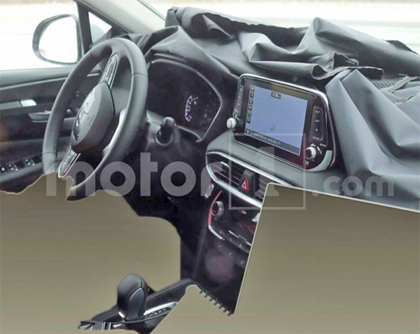
2019 Hyundai Santa Fe Interior
Last Updated:
Looking pretty nice and stylish.
Except… For that stupid tablet sitting on top of the dash. Again.
At this point, it is a design choice. Since the Santa Fe isn’t a bargain basement car. So this isn’t done to cut cost.
It is just a super lazy design choice. Most other manufacturers now make at least an effort to integrate the screen into the dash design.
Even Mazda. Their screens are not totally integrated, but they just don’t stick out like this one.
This cheapens the whole thing…
Head over HERE for more pix of that interior.
And HERE and THERE for teasers of the new Santa Fe.
And HERE for something completely different.


Despite that screen, this new interior looks more upscale than the current one. The current interior is really cheap looking.
Not hard to improve on the hard plastic look and feel of the current generation model Santa Fe. Huge improvement.
I think it looks nice!