WTF???
Last Updated:
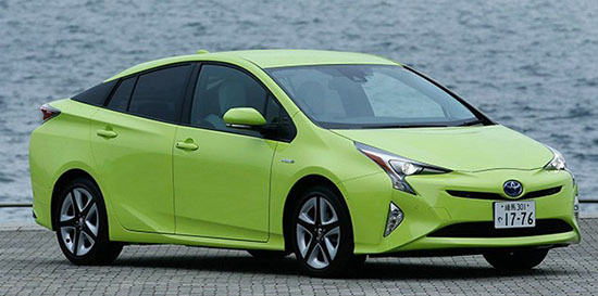
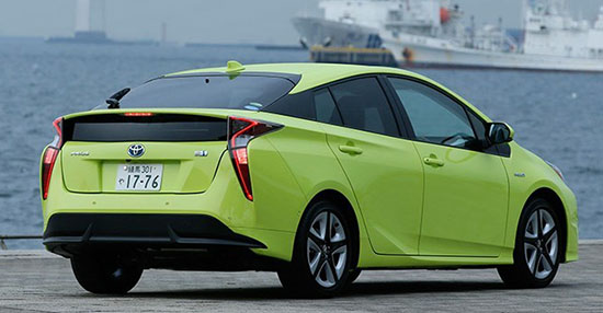
These are pictures of a Japanese version of the all new 2016 Toyota Prius.
So I am not sure if this particular color is available in the US or not.
Still… Just look at this mess.
I have to say, I am not anti Prius. At all. I actually liked the design of the previous version.
(And I like colors. It’s actually sad to see our streets filled with grey/black/white cars.)
I also have many friends who drive them, and, good for them, are very happy.
( I must say that all these people have one thing in common: they all hate driving)
The problem is how ugly the new one is. And it always surprises me when I see new pix.
Above all, that horrible color does nothing to help. It’s almost a joke at this point.
A really bad joke from hell.
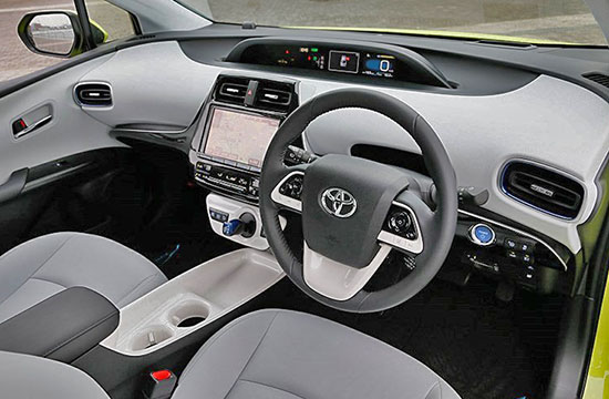
As I mentioned before, I actually sat in it. And it is even worse in person. Since the plastics are all pretty hard and cheap.
(For a car that isn’t that cheap)
There are no excuses, in 2016, for a main stream car design to look like this.


looking fugly! They messed it up.
I am a Prius owner and was hoping to buy another one. This design is grotesque and they have taken away the sunroof option. I sat in one at the Detroit Auto show which was easy because there was little interest in it. The interior seats were very uncomfortable and the upholstery is a low grade synthetic fabric. Everything about this car screams cost cutting versus innovation. I won't be buying another Prius. So sad.
Overheard at Toyota development "It needs something….what's the ugly colour we can possibly use?…perfect! This will prove the treehuggers will are colour blind sheep….muahahahaaaa!!!!"
was this photo from before or after the accident?
At least now GM can say that they didn't produce the ugliest car ever (Pontiac Aztek), in a single year Toyota snatched up the first two positions with this thing and the even worse Mirai.
In black with window tints and decent wheels, this car could look a lot better. It's like Toyota wants it to look as ugly as possible.
Are they styling their cars only for the Japanese market? Why do thy style every car to look like some sea creature? Obviously seafood is part of their culture, but now the cars have to look like something your sushi chef would be carving?
At least the bathtub is untouched on the console.
The color is the absolute least of the problems with this car. I rarely say that a car looks "stupid." But this car looks really stupid. Makes the Aztek look like a supermodel in comparison.
Wonder if the center urinal is removable?
That center-stack looks like Darth Vader glaring at you. While other brands are making hybrid vehicles that are actually very good-looking, Toyota seems to think that being practical means being bizarre and ugly. Makes you wonder if they did any consumer styling clinics…?
Someone paid Toyota designers to make the ugliest car possible.
It is like they want to kill the model.
A few weeks ago I sat on a European Toyota Corolla.
I was surprised how bad the interior is.
Low grade plastics and seats.
It is like a cheap car from the 90's.
Appalling.
It could be worse…oh wait no, this is as bad as it can get.
The very sad result of fukushima radiation fallout…..be sympathetic!
No, the center urinal is not removable. But you can use it up to about 45MPH. Which is actually pretty convenient.
Urinal/Drink-holder. … Yeah, that perfectly explains Toyota's target demographic with this design.
The sad thing about this is that it will sell good.
I would love for Toyota to comment on the press they are really receiving on this one. I am a current Prius & i3 Owner. I do like a little quirky, but this is hideous. Yes, the Hyundai ionic is generally boring outside but the inside looks decent. I might go Hyundai the next time around…
And then you look at the MGP figures in the Ford and GM hybrids sedans and wonder why Toyota can only get really good MPG in the Prius and not when they apply the technology to their midsize sedans.
I can't imagine that even brainwashed Toyota owners would want this. This thing looks seriously foolish. Did Toyota hire a guy named Homer to design it?
It looks surprisingly good in person.