2017 Hyundai Elantra
Last Updated:
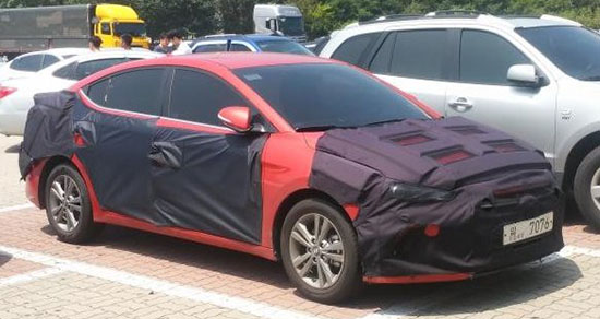
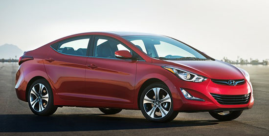
The current Elantra (bottom pic) still looks great.
Actually much better than even its more recent competition.
If there is one car that doesn’t really need a redesign, this is it.
Still, the unstoppable redesign schedule rules all. And what we have here (top pic) seems pretty ridiculous to me.
It looks like Hyujndai is pulling an “Audi” on us. Tracing the previous design and making it more square.
Why???


I realize the angle of the photos are a little different, but it seems like the overall design is less wedgy, less extreme upward sloping to the back but the same basic shape. Seems to be an even milder, less noticeable redesign than even the Sonata.
That is quite hilarious. if you look REAL close at where the windshield, hood, and A-pillar meet, you'll see a difference. Not better, just different as the A-Pillar now sinks into the render instead of floating above it to meet the hood.
– FusioptimaSX
Yes, the A pilar is different, and to me: worse. Less sporty, less coherent, looks cheaper. Car design seems to have reached rock bottom, seeing how many completely New cars look like cheap facelifts of previous generations….
Why??? Silly question, especially from someone so into cars. Hyundai started a new design language with the Santa Fe and it is now spreading through their lineup, as seen most recently with the new Sonata. The new Elantra, like the old one, will look like a small Sonata.
With all the very low mileage engine's problems every Elantra seems to get, who still buy that crap?
i know it's not going to have circular headlights, but it sure reminds me of a 1995 Dodge Neon here.
Every manufacturer changes their design every few years from rounded shapes to squared shapes…
This will go the baby Sonata route. My guess is that this will also address the past problems of the mileage and performance.