2023 Lexus RX: new illustration…
Last Updated:
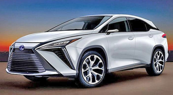
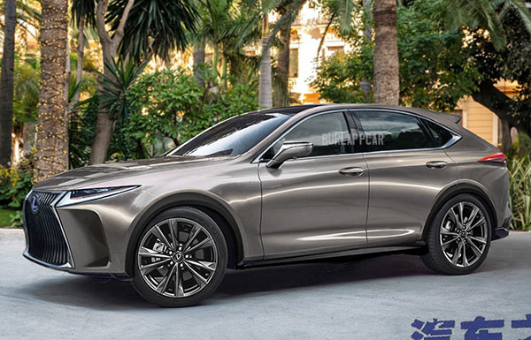
The top illustration is new. (The bottom one is something I’ve posted a few months ago)
Interesting to see different takes on what the next RX could look like. I think the top one is just way too close to the current generation. But the new NX is also pretty close to the previous one. At least until you actually compare both.
It would be nice to see a bit of a new design direction for Lexus. Or at least, a new grille. Or a different take on it…


hate it… trying to hard to be something way sporty… i'm looking for something sexy to go against the Aviator, Enclave, Palliside, CX-9 (soon to be CX-90?) Q7
The C pillar floating roof on the current RX is the most horrendous design element. Say what you will, at least on the Murano and others it's much better integrated. On the RX it looks like a last minute add on to look current.
I really hope not. Lol
This remains one of the stupidest looking vehicles on the road today. Toyota is lost.
Ugly, ugly, horrible. Lexus needs to get rid of the "hour glass" or cow guard look on ALL of its vehicles ASAP. It keeps getting worse instead of better.