2015 Cadillac CTS
Last Updated:
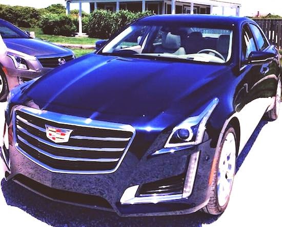
Looks like the only change is the new Cadillac logo on the grille. (You can see the 2015 ATS in the background)
Not sure it’s an improvement over the previous logo.
As it doesn’t really look more modern.
The rest of the grille looks like it was redesigned as well. Now with 2 horizontal lines instead of 3.
Not sure why…
PS: Sent to me by a reader. Thanks!


Oh Vince. Learn to proofread. Not that hard.
"The rest of the grille looks like it was redesigned as well. Now with 3 horizontal lines instead of 3. Not sure why…"
I think they went with 3, instead of 3, because 3 is a nicer number than 3, and also people associate 3 with modernity, whereas 3 is usually associated with old-fashioned cars. Also 3 is a lucky number, whereas 3 often means bad luck.
That's just 3 reasons why. I though about maybe only giving 3 reasons instead of 3, but chose to give 3 as it is better than 3 any day.
This is actually really funny. Thanks!
I'm not a fan of the revised emblem. It looks Chinese or something (probably on purpose) and not detailed enough.
The grill bars looked okay enough at first, but I'm not sure how well they're going to work with the rest of the design. (And the rest of the front end is still nasty–totally not fitting with the rest of the car's elegance and stature, IMHO.)
All that hurts to say, because I've been a huge fan of earlier CTSs (at this point in my life, I think the old 2013 model was one of the prettiest designs in vehicle history). But this thing is pretty much awful. They made an all new car look like a cheesy MCE of a car that came out in 2007 (which itself was an update of a 2003 model that came out in 2002, if not earlier).
So, what does Cadillac do for me???Absolutely nothing.
BTW, I saw a 2014 all lit up the other day at a stoplight (I've seen TWO on the road now–LMAO) and I actually laughed out loud. Talk about tacky.
LOL I love that you fixed the "3 instead of 3" error.. now it reads "2 lines instead of 3".. and yet there are clearly 3 in the photo! Not to mention the ATS in the background has to be a 2014, since the 2015 has just been revealed to also carry the new logo.
I like the grille, emblem, not so much. It just has that "aftermarket" tack on look to me. That's not a 2015 ATS in the background btw. You can see the wreath from here…and it looks so much better!
Kinda looks like a Chrysler now.
I love the way an oncoming CTS looks. The lights are striking. I'm a little over the LED-pixel thing, but this is different and looks good. The logo, well, will have to take some getting used to. The old one was around for so long that people will definitely have a strong opinion about the change. I always thought the laurel wreath looked really outdated and fussy, so I'm glad they got rid of that part of the logo.
Thoughts:
Stronger, c1eaner, 'c1assic' 1ook with bo1der bars echoing Esca1ade's upright gri11e
New 1ogo seems to have ho1istic connection to center bu1ge on hood– at 1east from this ang1e– adds to overa11 stream1ined presentation