2014 Mercedes S Class
Last Updated:
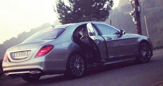
Looks like the squared off phase is over at Mercedes.
The new S Class seems much softer and rounded than their recent designs.
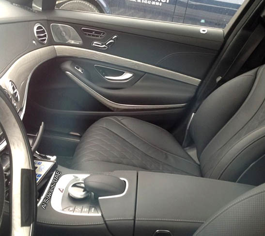
Same inside.
Which is good.
Since the S class always sets the design style for other models in the range.
Next is the all new C Class.
Which could turn out to be really nice as well. Even adding a convertible model.


Looks like nothing more than the previous generation with a droopier butt and no 1st generation Ford Focus fender bulges.
Absolutely nothing about this exterior design says anything truly forward-thingking or impressive, and the exterior appears to be just a miss-mash of incongruent circles, lines and arcs having very little to do with one another.
Yuck!
Exterior too round. The back reminds me of an old mist recent Lincoln Town Car. Not good. The interior looks top notch. Can't wait to sit in one and check out all the doodads.
Looks like it's melting from the rear. Not a good look.
I like the details on the interior–reminds me of FORD designs of the '50's; where the two-tone colors flowed from the doors to the dash.
The exterior, on the other hand, is a melted moteled joke! Did they learn NOTHING from the styling disaster that was Maybach??? Especially when Aud, Jag, BMW and Cadillac ALL have great-looking, distinctive, exteriors on their top-line models. And if the E or GL lose their "edge" with the next re-style, it may be a decade before I ever buy another Mercedes again!
Is everyone going crazy? This car looks nothing like the maybach. This car is beautifully sculpted and looks very similar to the Mercedes ocean drive concept. Great job beautiful
In case you haven't noticed; this IS the Maybach. Look at the rear door frames; tie the tail lights together with a red bar beneath the trunklid and voila! MAYBACH! The first gen Maybach was the S of 15 years ago (albeit restyled) and the 3rd gen is THIS atrocity (with minimal re-styling).