2014 VW GTI
Last Updated:
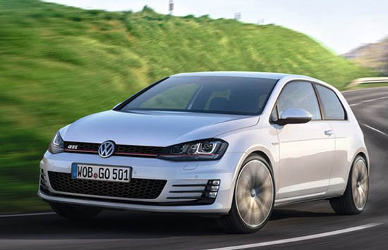
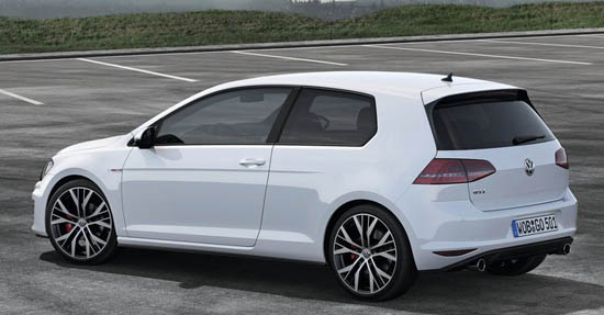
Now we have official pictures of the all new GTI. Based on the Golf VII.
No surprises here at all. Since we already saw the diesel version, GTD, last week.
So far, Euro specs are:
-220HP or 230HP from the 2.0 Liter Turbo.
-17 inch “Brooklyn” wheels.
-18% improvement in fuel economy.
-Smoked LED rear lights
I guess the 2.0 Liter is a slightly more powerful version of the one that will be offered in a couple of months in the Beetle Turbo and Jetta GLI. Where it will produce 210hp.
Many people here hate the look of the new Golf (Or just hate VW… Or just hate everything…)
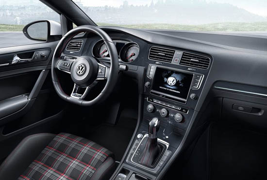
But I do like it. It has a “back to basics” feel to it, and the interior seems more upscale, almost Audi like.


Nothing but love from me!
Nothing but love from me too. I love the fact that VW has such clean, basic design inside and out at a time when other cars just look muddled and alike. It's a timeless design that works so they can afford to be evolutionary with it instead of revolutionary. Oh, and the plaid fabric seats are just plain awesome.
As a Golf owner, I'm biased but I have to say VW has done a great job with this. I was afraid that with the Corolla-ization of the Jetta that the next Golf would look like a Matrix. This one looks true to the GTI name.
Vince,
It's not so much the quality of the plastics (although the dark grey looks more like faded black than something done on purpose), it's the fact that everything you see and touch is some shade of grey.
VW is trying to come across all "German and serious," but it's just depressing. I had an 80's Jetta that had a fantastic interior: lots of different shades of the base color, lots of different textures, and seat fabric that looked good and never wore out.
These new VW interiors remind me of the old SNL Sprockets skits. It's a parody of a German car.
ZZZZZzzzzzz
It will still get pissed on by everything but the Si in this segment.
Who cares if it has a nice interior, it is slow and boring. If I wanted a nice interior with a boring car, I wouldn't be buying a VW.
It's just boring like the Corolla. It's not back to basics really, it always was this design just different front and tail lights in every generation.
Passat and Jetta aren't exactly looking progressive either.
Audi badged as a VW….
stubborn VW, same as porsche. We build this, you buy this attitude will hurt them. You have to keep up. The CC was a huge leap forward and a pretty pretty car. The latest iterations of passat, jetta and this, wow, plain, bland cheap looking. It looks like a low cost version of VW for emerging markets.
Vince, your reader comments definitely do seem to attract haters and wannabe car designers. Makes me laugh!
I don´t see what´s wrong with the design. It´s a Golf – but this time with a clean, thoughtful and accurate design.
Having seen this car quite often on German roads, I can tell you that it looks valuable and has a presence on the road you can´t see on the pictures. And no – I am not he biggest fan of German car design, even though my words might sound like that.