2014 Lexus IS
Last Updated:
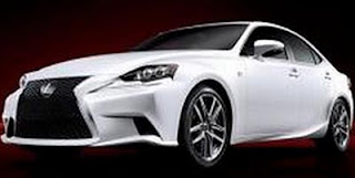
Just when I thought it was going to look too much like the current model…
They pull the old “crazy details squeezed into a familiar shape” trick.
Which makes the whole thing rather busy looking. At least on this white car.
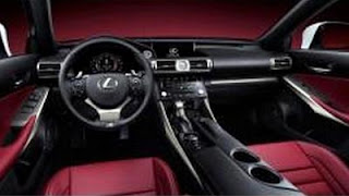
The interior now looks like all other new Lexus model.
We’ll have to wait to see better pictures, and especially other colors. As I mentioned before, the coupe version might work better.


Tacky
This looks like people will notice it, for good and bad. Hopefully, the Infiniti Q50 looks a lot flashier than this, if not better. It seriously needs it after dropping G37.
The back end looks as if the Acura TSX and the GS crashed into each other.
the Q50, from Infiniti, likely sharing Mercedes and Infiniti/Nissan technology , should trounce this dud!
What a way to f**k up the IS's what was ORIGNAL LOOKING and EARTH SHATTERING exterior. The Kia Optima looks better than this.
Exactly. Just because you put some crazy front and back it won't make design bold if everything else stays the same.
Well… At least it's 'interesting' which is far more than can be said for the 3-Series (which looks like like nothing more than the old one with eye buggers and a 5-Series rear), the A4 (which pretty much looks like every Audi sedan for the past 12 years save the reshaped X-Mas lights on the front), or the C-Class (which just looks too small, too cheap and too insignificant for a luxury vehicle).
Not really into Lexus vehicles, but if this drives as well as the (absolutely hideous but well-performing) GS, it'll likely prove very competitive.
i do like how the spindle frees the design prominance of the headlights, allowing placement to up and back while (assumably) meeting the whacky asian/european pedestrian safety regs…
Holy horrendous. Front end looks like the predator with a cleft palate, side looks too elongated, the tail lights look like the car has downssyndrome. Interior not too bad
This has the ugliest front end I have seen on a car in ages! Really Lexus?? Fire your designers before it is too late. At least let them stop designing while on mushroom trips….
ToyoLexus seems to be going the way of Acura in the styling department. They should just outsource their design to the Germans or Italians like Kia did.
Hmmm… who now has the ugliest grill—- Acura or Lexus? Bleh! They are all trying too hard to be different. Way too hard…
I'll wait to pass final judgement until I see it in person.
The new GS, particularly the F-Sport looked TERRIBLE in pictures but it looks FAR BETTER in person. People said that would be a flop, but it has been a big success for Lexus.
The interior looks to be an improvement.
What a mess.
No new Toyota or Lexus looks good. The designs are a horrible mish mash of boring cars trying to be flashy. And WHAT is with the interior!!! Hey Lexus, 1993 called, they want their dashboard back.
New Toyota Avalon is a hot car. New LS is hot. New lx is hot.
No one seems to point out that Infiniti is trying to use a similar grill design..?
As far as the interior I'm feeling the 80's retro
@ January 10, 2013 1:04 PM
Please, fool, show me another interior from 1993 that even is SLIGHTLY similar to this one.