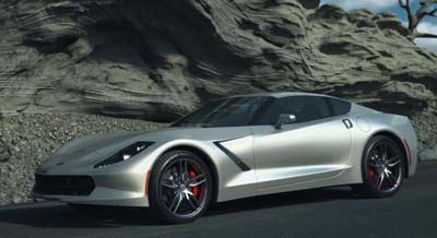
2014 Corvette Video illustration
Last Updated:
This actually a really cool idea.
Trinity Animation decided to put together pretty much everything we know so far about the next Corvette, and build this video presentation of the car.
It does look like a video game intro. But also could give us a good idea of what the actual car might look like.
What a great idea. This is better than Photoshop.
And even though most of it looks like, well.. A video game. Some of the shots are really cool.
About the Corvette. I just hope it ends up looking a bit better than this.
The one pictured here looks like a blend of many styles that are jus trying a bit too hard.
We will know everything early next year when the real thing makes its debut in Detroit.
You can click on the title to find out more about Trinity.


Ugh, I don't know about this..that front grille says nothing and the Cormaro rear…
Although I can afford it, this a car I haver wished to own or test drive.
Let's hope that's not the next Corvette.. other than the fact that it doesn't resemble a Corvette in any way, it looks too much like every other sports or sporty car on the road. Nissan Z front end, Genesis Coupe profile, etc.. not at all attractive or fitting of the Corvette name.
At first I was disgusted because it looks like it's suffering from generic sports car with giant spoiler syndrome, but that picture is just a shadow. Watching the animation makes it actually look good, outside of some crude sharp angles.
Agree with FusioptimaSX – it looks pretty good in the video, but I'm not a fan of the greenhouse. It's too similar to the FR-S, which sells for 1/3 the price.
What a sweet rendition! I really like how the car was changing colors in the tunnel. So far, I really don't like the Japanese-black A-pillar, and what's up with the carbon fiber tail light eye masks?? Also the front spoiler looks funny pointing upwards. The head lights and rear fender LED lights are pretty sweet. I like the overall shape and edginess of the design.