2013 Hyndai Tucson
Last Updated:

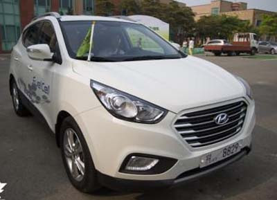
The Tucson gets a new front end for the new year.
Not an improvement. At all.
It actually pretty much ruins the front of the car.
Trying to squeeze the new Santa Fe’s grille into the smaller Tucson just looks too weird.

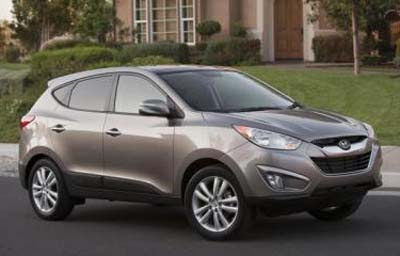
Here is the current model. Not perfect, but so much better….

I think its much improved although not as original. I looks a bit like the FX to me. The 2013 will sell just fine
I disagree. The current front end throws me off.
Looks Good.. lending the entire front a much more cohesive aesthetic.
Nice look. I like the incorporation of the more upscale headlights and aggressive grill.
any pics from back?
The old one was not that great, but this no one is ridiculously to big and flat. Maybe if it had be 3 or 4 bars and have the bumper jut out a little.
I think the new one looks MUCH better!
Vince, it is the oversized front look due to the shot that makes it look awkward. It will be a nice evolution. Better than an Acura beak.
Definitely an improvement over the existing front end.
:: Thumbs up ::
Looks like the grille on the new Ford Fusion!
Hi,
Hyundai – Ford would like their grill back.
I have to wonder though – w/ this, the Santa Fe, Avalon – there is a theme of the 'grill' happening on those cars…is that the design theme of the immediate future?
"Ford would like their grill back."
Actually, Aston Martin would like it back … from Ford!
GEEZZZUSSS this thing looks stupid. The mental midget that penned this design is just a psychotic brat.
GEEZZZUSSS this thing looks stupid. The mental midget that penned this design is just a psychotic brat.
…are you projecting?
Are you the mental midget that penned this twit mobile?