2022 Honda Civic Sedan: new photos…
Last Updated:
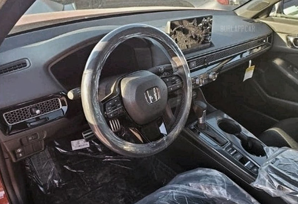
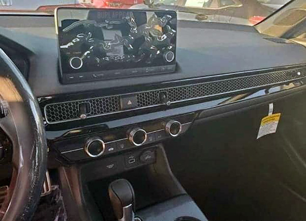
These are, obviously, photos taken at the factory. These cars are ready to go and waiting to be shipped to dealers around the country.
Nothing we haven’t seen before. Of course, the tablet looks completely out of place, but the rest of the interior has grown on me. And I do like the weird “retro but not really” vibe of the vents.
I will mention this again, but I think a Hybrid version of the hatchback would be great. And a much better use of their excellent hybrid system than the “close to zero sales” Insight. (Less than 16 000 sold last year!)


Still not really liking this new Civic interior, too much like the Kia Forte and not enough like the Mazda 3, which integrates it's screen much better.
The lack of sales for the Honda Insight baffles me. It is basically a smoothed over Honda Civic with a very efficient hybrid powertrain. The exterior and interior styling is better than the Civic imo. The reviews were always good too.
I agree about the Mazda 3. Best looking interior in the segment.
I drove the Insight and really liked it too. I guess Honda isn't pushing it at all for some odd reason…
I agree. I'd live a Civic Hatch (or wagon – which will never happen) hybrid, especially if they don't turn it into a total Prius econo stripper, but maintain the sportiness of the Civic hatches.
As far as the Insight, I think that's a function of a few things:. Limited batteries and pushing more toward the hugger margin Accord and CRV hybrid; Covid screwed everything up in terms of mfg and scheduling- they had to focus on making more money; and finally the bigger push away from the highest econo hybrids towards BEVs. Where did Prius buyers go? TESLA.
I'm more hybrid interested than BEVs – it's just a function of where I live and driving distances.
I love this interior. More the Mazda 3 even. That single horizontal vent is perfectly executed. Very simple and cohesive design. I still like the 3's interior, but I look back and find it quite lumpy with weird layering shapes and some disjointed lines. The vents also feel like an afterthought where here they're driving the design in a more unified way.
I also don't mind the stick-up-tablet screen. It's close to the driver and more usable instead of pushed back and inaccessible.