2013 Lexus ES
Last Updated:


Many people love to hate the ES.
Maybe because it is still based on the Camry, or maybe it is targeted to an older demographic.
The truth is, the ES has always been a strong seller for Lexus.
And it looks like they are using the same recipe for the next one. Camry based, soft lines.
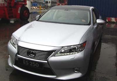
It does look pretty upscale. And the new Lexus face works much better here than on the new GS.
The 250 model pictured here will not be sold in the US, as we are getting the 350, using the same V6 as the 2012 Camry.
A Hybrid is also expected for our market.

The front says "1961 Plymouth Fury!"
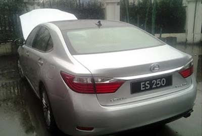
The back says "Another great economy car from Kia!"
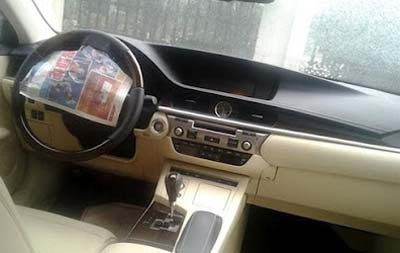
The dash says… not much.
Really? Lexus…REALLY? I cannot tell the difference between the front fascia of this and the GS. Lexus GS and the new ES interiors are taking an old BMW non flattering design…..why? In a time that Lexus could have redefined itself, its trying with a half-azz approach. I can't leave Infiniti out either, these pinched cheeky faces are spread on new Infiniti's as well the new FX, JX, and new models…. who in the hell said this was a nice direction to go in?
Nevertheless Acura seems to be "trying" to get its act together. Maybe the tides are about to turn where Acura may make strides based on the design merit alone.
This is great. Its a huge seperation from the Camry.
love it. love the us of "origami" folding, neat lines, the general lack of german front to upper back and again from lower back triangulation.
Not sure why you have such an issue with the front end of the GS, but not the RX or EX, when I think they look a lot alike, espceially the GS and the EX)…I thkn the design is a big improvement
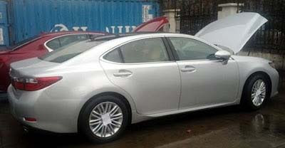
I still see the last gen Camry/ES lines in the side profile (mentally put the chrome back unter the the rear quarter windows to see what I mean).
The front end is the best part of this. I didn't realize the rear design of the current LS was still relevant. It looks like a mix of the pre-referesh current gen LS and the Chinese/Russian market Camry.
No bueno. The current one looke nicer overall.
– FusioptimaSX
the car looks way stretched.. almost the size of LS.. is it just an illusion? looks very upscale
That's the best Production version of the new Lexus grill
Ps love the way they through a news paper over the steering wheel emblem, but the cars plate is the model
With the exception of the hideous front, it looks like a Sonata. Not good.
Lexus said the new ES will blow away the Buick LaCrosse. Interesting point is that luxury Lexus even felt the need to point-out that near-luxury Buick is real competitor.
On style alone, I'll take the LaCrosse which to my eyes appears more luxurious with more contemporary styling.
i am not sure of another car that looks so weak and feeble except the new camry….let's face it, in the wake of more recalls than any other in history, toyota still hasn't captured an attractive style direction. The grill is an attempted ripoff or copy of the current infiniti front end
It's ridiculous how Toyota just replaces front and back and calls this a full re-design for another 5-6 years.
Seems to be trend now:-(. You just know now how each Lexus/Toyota model redesign will look like for another decade.
"It's ridiculous how Toyota just replaces front and back and calls this a full re-design for another 5-6 years."
Its time to change your prescription of glasses
The exterior looks nice. The interior however makes me want to rip my eye balls out of my sockets. It's HORRIBLE! Kill it! Kill it with fire!
Only the nose is acceptable. The rest is so stale and boring in design. The profile makes me thinkk of the last generation Pontiac Grand Prix….so not good!
BACK TO THE NOSE…its so aggressive and sporty. The rest so stale and boring. It's like putting a sports bra on great grandma.
"Interesting point is that luxury Lexus even felt the need to point-out that near-luxury Buick is real competitor. "
I think Buick is stealing a lot of sales from the ES. My neighbor gave her Lexus ES to her daughter and now has a Lacrosse for herself. The ES looked out of place in a neighborhood with $2m homes. But the Buick, while being a little less expensive than the lexus, is much more impressive visually.
This new one is not attractive at all.
Maybe it will look better in person. Looks butt ugly in pictures!
The biggest problem facing the ES "redesign" is the geriatric looking interior.
This car is absolutely meant to appeal to the 60 set and older crowd. Toyota/Lexus sycophants can crow on about how much of an overall "improvement" the cars exterior design is, which is highly debatable as in my opinion, it is a step back.