2013 Lincoln MKS
Last Updated:


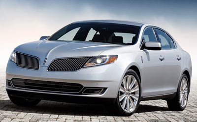
Another case of a new grille trying to turn things around.
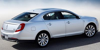
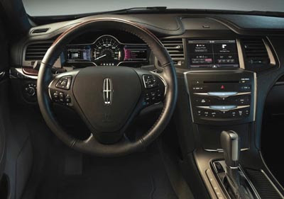
And a few small changes in the rear as well. And more inside.
The MKS seems like a nice car. But it is just invisible.
Plus, try to convince anyone under 80 to buy a Lincoln. Good luck.
Ford needs to spend some money into advertising. Or even letting people know that Lincoln is still around, a least.

Poor Lincoln, struggling to re-discover their brand identity. How many looks can they go through on their front-end design? This one looks like what a Mercury version of this car would have ended up with. In other words it looks LESS expensive than the existing version. Those single lamp headlamps are really "downclass". In my opinion vertical grilles need to GO BIG to be successful. When used in a lower-height format like this it just looks cheap. The 2009-12 version was bold, impressive and a successful iteration of the classic Lincolns of the '30's and '40's. As much as I've loved the big Lincolns over the years -Continentals and Marks, I have to say this is really, really sad compared to how Caddy has really stepped up to the bat with bold identity and performance. Start turning out the lights, Lincoln. Time to follow Mercury into the automotive history book.
Robocop movie?…
look out lincoln here comes the XTS !!
This is what Ford deemed good enough? The interiors are nice, but not world class. The exterior design is just outdated, and these grille updates look horribly aftermarket. I actually like their Edge-based SUV (can't remember what it's called) but that's about it. Ford is on a roll with their cars and trucks. However Lincoln is lost.
You are right Vince. I had forgotten Lincoln existed.
I was looking at the previous MKS and just couldn't get over the retro 1950's lincoln heyday aerotech interior. This one, I may have purchased…
As for marketing, there's a reason that prosepective buyers are "80"; Lincoln, not everyone understands the relevance of the Mark (MK) nameplate.
JESUS! NOW I AM WORRIED ABOUT THE MKZ!
This front end reminds me of an eagle beak… The interior seems pretty nice.
you guyz… I've just seen the live pics from autoblog of the MKS and MKT live reveal from LA Auto Show….
it looks amazing! Very very sharp, and the smaller slots between the grill inserts give it a very very refined look. The mercedes Benz A-class concept has a similar concept on its grill except it was more of a beaded design (instead of straight-bars) and the patterning is more interesting then this one.
These pics don't do the car any justice and hopefully Vince can get some himself from the la auto show.
The one reservation I have about this (and the MKT, the Flex, and other fomoco products) is that new squared-off cutout behind the grill. It is probably to increase fuel economy but it is executed in a very cheap manner. Spend the extra money to either find better grill inserts that hide that opening or find another way to fix it because it is disgusting. I can't wait for the MKZ!
Lipstick on a pig.
Customer target is older and overweight.
Front is better; but still has the same formula that BMW had 30 years ago: Unsurpassed mechanicals but ugly inside & out. Old tail lights were actually more unique & better looking. Styling has always sold Lincolns and those customers aren't impressed by CTS-like handeling or performance. You've got a great car here Lincoln; but until you get back your styling groove, your sales are destined to share the basement with Acura!
Lincoln needs to scrap this entire front end design and start over. Tweaking the plastic bits won't be enough to fix this thing.