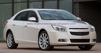
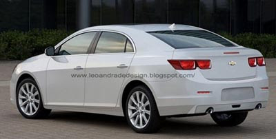
2012 Chevrolet Malibu illustrations
Last Updated:


These are the most realistic illustrations I have seen of the next Malibu.
I guess we should be seeing the real thing very soon.
I still like the current design very much, and I am not sure the next one might be such an improvement. Although spy pictures have shown a very modern looking interior.
The 2012 will replace the V6 with a 2.4 Liter Turbo option.

this still looks very american.
most u.s. car start to look wanna be japanese. i hope the malibu does well.
Looks like a Lacrosse chop… That isn't a bad thing thought
GM should just offer a version with the Camaro front end and market it as an alternative to the Dodge Charger SRT/8 and the Ford Taurus SHO. When two doors just ain't enough.
If nothing else, the tail lights are a big improvement. That's the one weak spot on the current design.
To tell you the truth, the current version hasn't grown old on me yet…I'm really still taken aback on how "elegant" it looks compared to the crap sold previously.
That is one optimistic render of the rear though. I'm really curious to see there the turn signals and reverse lights will end up.
I don't think the "4dr Camaro" concept is a bad idea, but it's sad that it was only executed for the rear and doesn't really match the rest of the car.
How about Chevy hurrying up to redo the G8 as a Charger fighter..This Malibu looks vanilla as the color suggests, and a me-too family sedan that will go unnoticed at malls and such.
I think this looks a lot like the last generation of the Accord. I agree with most of the comments here, not bad, but not much of an improvement on the current Malibu. I hope the interior does not copy the Camaro dash, it is really tacky looking.
"most u.s. car start to look wanna be japanese. "
These days, no automaker wants to look Japanese. Have you seen what the Japanese are designing lately?
I do like the current Malibu. I think I like the c-pillar a bit better on the current one. If there is one area where I'd change the current design, it's the tail lamp area. This looks a lot more coherent. But overall, it's an evolutionary design of a really good looking mainstream car.
No Thanks. I like the current one–better than ANY car in this class. But there are SEVERAL competitors I would choose over THIS.
-very disappointed.
This is less intersting to look at. When is chevy going to dump that boring front look? Volt is the only car it looks good on. But I think that is because the Volt has a clean sharp looking headlamp design.
This illustration is really toned down from the focus group one I saw 2 years ago. The tail lights are about same but the front is completely different. Looked much much better on the concept. The side view is also off. The rear window line took a stronger upward angle so it wasn't a straight line from front to the back. This has less detail and is boring by comparison. I just got invited to another focus group. Can't wait to see the cars in this one.
The current Malibu is a surprisingly handsome, clean design. I hope GM continues this theme with the 2012 version
"Replace with an ….option."
Vince, What does that mean?
I too like the current Malibu
imho the greenhouse is very elegant
actually don't mind the tail lights
as much as I'm tired of the Chevy grille(s)
looks like a camaro from the rear!
BRING BACK PONTIAC. globally!
GM doesnt have a sporty brand anymore.
Are they going to put a hamster-on-a-wheel engine in this thing as well? And charge $30K for it?
To whoever wrote this:
To tell you the truth, the current version hasn't grown old on me yet…I'm really still taken aback on how "elegant" it looks compared to the crap sold previously.
This makes zero, zero, zero sense.
You don't like the current version becuase it looks better then the previous one?!?
I think it looks better than the current model. Gone are the bull's horns back lights.
There is such a thing as 'too simple' a design. This reminds me of the previous generation Honda Accord, with the faceted lines. That was ugly as hell in its simplicity. If this is truly from Chevy, they need to work on the front and rear a bit more. For some reason, Chevy never can design decent tail lamps. Plain red lamps were great in the 80's, but move on already. And family's certainly wont buy it. (whispered) PS> its a family car.
They should have redone the Impala first, then the Malibu. The Impala is ancient, and this doesn't look that much better than the current model.
I think this is one that looks 'good' in pictures – but will look that much better in real life…similar to the current Jetta really.
Looks good….The interior looks as stupid as the Camaro though.
Looks too much like a Ford Fusion in profile.
To Anonymous on February 17, 2011 @4:49 AM:
"To whoever wrote this:
To tell you the truth, the current version hasn't grown old on me yet…I'm really still taken aback on how "elegant" it looks compared to the crap sold previously.
This makes zero, zero, zero sense.
You don't like the current version becuase it looks better then the previous one?!?"
That's most definitely incorrect. I love the current version and it's looks have NOT yet grown stale to me. It's light years ahead of the previous (2004-2007) generation.
Chevy is so damn lame lol! Get rid of that damn corporate grill already!!! While you're at it, nix the tired gold emblem and I hope that's not chrome around the tail lights. Who told them that was cool? Cruze meets Camaro. LAME!