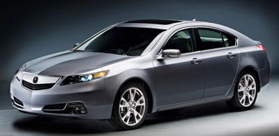
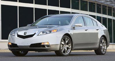
2012 Acura TL
Last Updated:


For once, a new model is actually a toned down version of the previous one.
There are only small changes to the TL for 2012, but they do make the car a bit less aggressive. Which is what most people wanted I guess.
And the new grille is similar to what they’ve done with the 2012 TSX.

Huge! Looks better.
Grille is still hideous as are all Acuras (and Hondas) in general
Could they make it look more like a Saturn? Yes, they did!!
The worst gets slightly less horrible. But not enough to be competitive.
I agree – looks like a saturn aura – -but actually not as good. why cant honda design an attractive car anymore
It's much better, but this car just doesn't move me. Still hate the rear end and hate the dash!
But in all fairness to Honda, Japan is just not producing good looking mid-size sedans. Most look over styled, over wrought or just plain ugly! Perhaps it's a cultural thing and this may look good to most Japanese.
What allot of people aren't really getting is that this is not an all new car, just an update. If this was going to be the style for the next 5 years then I'd say it was horrible. Though I wouldn't say the grille was perfect, it's a million times better
I do not think the grille looks that much better. People are tired of bitching about it and start geeting used to it. I would love to buy the MDX, but the grille and 21 mpg on the freeway will make me look elsewhere.
So poor… I prefer the old one (2004 – 2009). The 2004 still look good !!
Perfect. grill slightly less smaller=slightly less uglier…
That's like saying this dog turd is a million times better than that dog turd. This pig needed a helluva lot more lipstick than it recieved. This is NO improvement AT ALL.
I doubt this lame revise will move the sales meter at all. I can't imagine who would choose this vehicle over an Audi, BMW or Lexus.
So Honda went in the opposite direction with this compared with the Accord. They actually took OUT some of the ugly….good for them.
i think the over-done grill distracted people from the strange, cheap looking front end cutlines, the thick roof pillars, humongous front overhang and generally ungainly proportions. none of which have changed.
seriously, this is what honda designs now?
it's hard to believe the same company came up with some of my favourite designs of the last twenty five years (but not the last ten): mid 80's civic hatch, early 90's civic hatch, 80's accord, prelude, original odyssey (okay, it wasn't gorgeous, but a nice 'n tidy well-sized minivan) to name just a few that were available in north america.
I actually think it is a huge improvement.
The six speed manual and SH-AWD version is a blast to drive!
A little bit of plastic trim changed. No big deal. I like the car overall.
I agree- huge improvement. Great car to drive. And they fixed a lot that was wrong. The grill never bothered me as much as the bucktooth that accentuated it in the bumper, and the catwhisker openings. Worse was the cartoon reflection of the front stamped onto the rear. And the interior was far too plasticky – like most Honda products ca 2005 (think aluminum look plastic steering wheel and dash accents). I expect sales will improve. I cant say the same about other recent Acura or Honda offerings. Please, someone at Honda- have the balls to axe the CrossTour for godsakes. It does to the Honda line what the TL was doing to Acura -ie. focuses all the attention on the mistakes.
HONDA needs another chief designer.
They should have fired all the designers & engineers and just bought SATURN. At least they'ld be above "middle-of-the-road"
This grille is such a turnoff. I wish Acura, for its sake, had taken a survey to identify how many prospective buyers this hideous design turned away.
This design screams "we did not know what to do with the front and plugged it with something until we come up with an idea…later.."
If the new Dodge Charger can have REAL GENUINE ALUMINUM on the dash; why can't this "premium" Honda??? Silver painted plastic doesn't cut it — not on the grill, dash, or ANYWHERE!