More pictures of the new Honda Fit Shuttle
Last Updated:
I like the idea of a super sized Fit. Why not.
But where are the designers from the Fit?
The people responsible for this seem to have been stuck in the early 80’s.
While the regular Fit looks like a modern car. This is retro in a bad way. With weird proportions.
I just don’t get it….




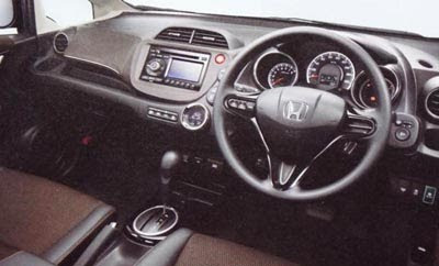
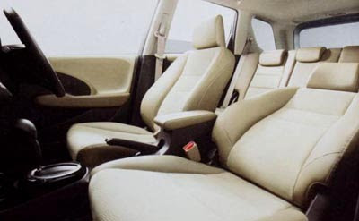
2001 Called. It's wants its tail lamps back.
Seriously tho. This is really bad.
Wow, this is shockingly terrible. Recent ugly Honda designs: CrossTour, Element, new Odyssey, and now this?? That C-pillar is a joke, along with those matching wheel covers. The front end is passable and the tail lights are ok.
way too much overhang on both ends. looks like it's from Russia. awful.
Vince, let me see if I can find that picture of the Fit Shuttle where someone had photoshopped some nice wheels on it. It honest to god looks like a COMPLETELY different vehicle in a very good way.
Those wheels that Honda chose are some of the ugliest OEM wheels that the world has EVER seen.
To my eyes, it's as ugly as the current Fit! As others have said, fire the designer director.
A $10 can of black spray paint could work wonders for that rear pillar.
I see why they call it the Shuttle, it's looks like something from space.
The Chinese aren't raising to European or American levels nearly as fast as Honda is sinking to "below the Chinese" levels of quality & finesse.
I mean Honda really did a horrendous job on this thing
What has happened to Honda?! Every new car looks so much worse than the last! Everytime!
Okay.
It doesn't look THAT bad. At least it's not Aztek or Crosstour fugly.
That's about the kindest thing I can say it…
"At least it's not Aztek or Crosstour fugly."
I have to say, even though the Aztek is a hideous vehicle, they were at least a pioneer at trying to carve out a new segment. So you have to give props to the recently departed for the noble but failed effort. Honda has surpassed them many times on the ugly-meter, and there's simply no excuse for such continued amateur hour 1970s sci-fi design. Anyone else see a little Kroft Superstar in this thing?!
Miss-Fit!
Who'da thunk it – Honda has finally become 80's Mitsubishi-ugly.
It looks like a scared ferret. How old are Honda designers? Are there no child labor laws in Japan?
Oragamy in sheet metal.
YIKES!!!