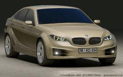
2012 BMW 3 series
Last Updated:

Obviously just an illustration, by some talented BMW fan.
But it does look really good.
A nice update on the current car.
We’ll see very soon what the real thing looks like…

Last Updated:

Obviously just an illustration, by some talented BMW fan.
But it does look really good.
A nice update on the current car.
We’ll see very soon what the real thing looks like…
Nothing new here, but nice drawing.
Who Knows, but one thing's for certain… this 'rendering' falls directly in line with BMW's current 'play it safe'/one design many different sizes' philosophy.
They might drive well, but these new BMWs are nothing at all to look at.
I would take a design off the internet before i would pay some self-proclaimed infantile "stylist" to come up with something a retarded child could do.
Nice car but I HATE that x6 looking front airdam.
Big nostrils and very small headlights. There is also a strange upsweep on the side that almost lookks like cladding.
I think/hope the real car will look better than this.
I do like the front but it is too slab-sided. It looks like the tasteless sides on the Taurus,,,I know they do it for fuel economy reasons but stupid looking doesn't sell well just to save 1/2 MPG.
sorry, but that's just terrible. that's a cross between the x-6 and old 5 series. terrible.