BMW 6 series Coupe concept
Last Updated:
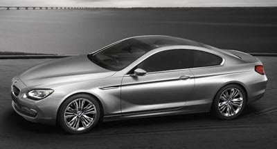
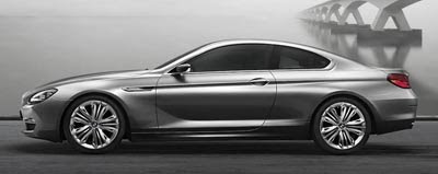
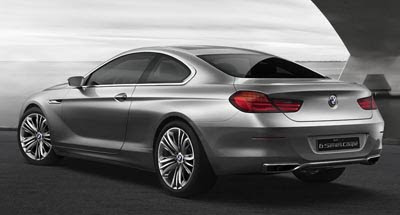
What you see here is pretty much the next 6 series that is coming out next year.
I don’t know why they even call this a concept.
BMW has said the Grand Coupe concept from a while ago is going into production. This new 6 series coupe looks like a 2 door version of the previous concept.
So I guess the next 6 series will have 2 body stiles, 2 and 4 doors.
The 4 door one is just a weird idea.
Another 4 door between the 5 and 7 series?
At least the new Audi A7 is a hatchback, which does make it something different….


This is shocking only in it's generic blandness. I mean it looks like a 328i-long wheelbase version. Talk about way over-reacting to the Bangle controversy. If I were on the BMW Board I think I'd hire Bangle back IMMEDIATELY! This is just milk-toast lame……..
As a day-trader I'd be inclined to buy puts & sell calls on a company so errevicablly UNinspired.
Why not just buy the actual Honda Accord coupe and not this copy?
It looks so good it hurts. Classic and Classy. BMW has really gotten over the unfortunate Chris Bangle episode.
Those who want in-your-face styling can go out and buy a Dodge Ram.
It looks like the original Lexus SC from the 90's. Seriously, BMW?
Although I'll never buy one of these, it looks so much better than the current clunky chunky design.
I really like the front end, that's about it. I've seen some other pics of it and from some angles looks really bloated. This is beyond generic and just like a few recent hyundai's, a lot of un-necessary lines and curves, just for the sake of having them, but they are in vain as they add nothing to the design language. I too miss Bangle.
Not feeling it. I agree with the first post, looks like a stretched 3'series coupe. I like the rear but that's all.
i alwqays assiciated BWW with futurism. this looks bland and conservative. but it does make sense if will see a 4door version of the car.
the previous generation looked better.
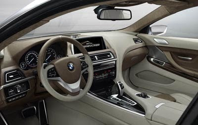
I think it looks great! It reminds me of the old 8 series coupes. The interior looks great too but….I dont like that two tone coloring. It's kinda too busy. Too much contrast difference all over the place. I'm sure it'll be comfy and of good quality though.
It looks like an evolution of a 90's Infiniti, and that is saying A LOT about the design choices of BMW.
Inside and out….this is a Volvo, period!
wow this is so expired… i cant even look at it to buy one.
A tremendous improvement over the droopy-nosed/fat-arsed mess that is the current version, but it follows the same exact aesthetic as every other newly revealed BMW – It's Dull As Dirt!
(NOTE: save the uncharacteristically very well done interior)
It is an improvement..The top car companies know Evolution over Revolution. Say what you want about Chris Bangle, but Its because of him that every car company is breaking out of the mold
These pictures do not do this car justice. Check out the Bimmerforum for better shots. This car is actually quite elegant and a huge improvement over that Bangle mess
Reminds me of Lexus SC. Get out your hairpiece and white shoes.
I absolute LOVE the current ( & previous) 7-Series interiors–dash especially. But this interior–this would be bland for even a Toyota. BMW COUPES have fallen a long ways since the 6-Series (& 8-Series) of the '70's & '80's. Just because Mercedes dumbs-down the E Coupe Dash from the much-better-looking E Sedan's Dash; it doesn't mean you're obligated to repeat their mistakes, BMW!