Mercedes CLS
Last Updated:
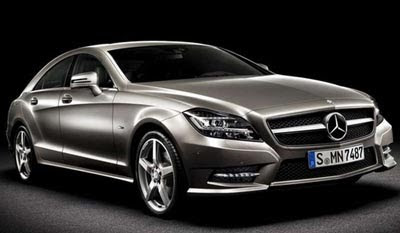
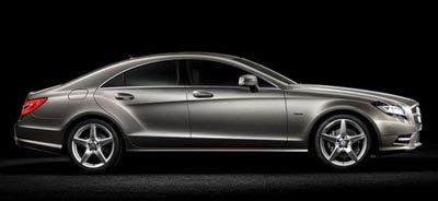
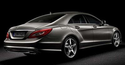
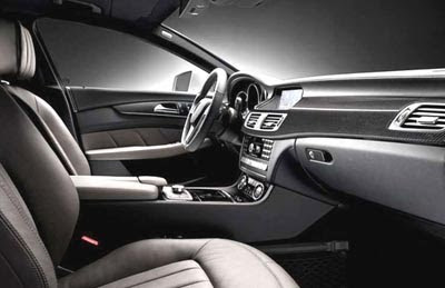
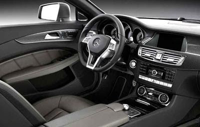
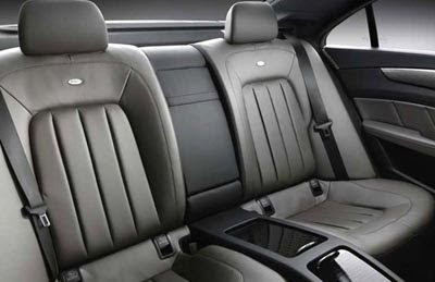
Another car that should not have been redesigned.
The CLS has been one of the best looking sedan on the market since it came out.
The all new model is not an improvement.
don’t get me wrong, I’m sure it’s a great car.
But it really doesn’t look better than the current model.
Inside or out.

Looks like an ugly sea creature.
Eventually most cars have to get redesigned, we all hope it is for the better. Look at this, wrong way, TL wrong way, most Lincolns and Cadillacs right way. BMW usually does a good job on all their redesigns, except maybe with bangle butt.
The side profile does look more coupe-like but the overall design isn't as cohesive as the current CLS. I'm sure they won't have trouble selling it though.
funny thing is… mercedes stole the taillightts from Volkswagen CC
Wholly inelegant (was an elegant design the purpose of the original CLS?). The rear door is absurd.
The second-generation CLS is a status symbol.
The first-generation CLS is a classic.
That's all I have to say about that.
I don't know Vince, I think it is absolutely GORGEOUS and especially so in the side profile shot.
My goodness what I would give to own that.
My, what big hips you have now. Didn't you used to be svelte?
Truly a matron instead of a swinging single. Too bad.
I have to admit….while I didn't like it after seeing the spy shots a while back…it's definitely growing on me.
I think its nice. I really do. But VW, DON'T DO ANYTHING TO THE CC. It's the best looking sedan you got.
well, they say the rich get richer…and the ugly get uglier…or at least different-ugly…
WHAT THE FUCK IS THIS?????OMG GOODNESS MY EYESSSSS!!!!!!
I like this a lot. The current car has never seemed quite right to me, but this is sexy as hell.
But I have to agree about the Passat CC. VW nailed that car´s styling, it´s the most handsome 4-door coupe by far.
I wasn't sure about the redesign but I like it a lot….looking at the current CLS it looks quite dated now especially the interior…..
Redesigning a car like the CLS was always going to be difficult. I think overall they did a good job. It's all very well to criticise but how many of you could have done better?
Vince,
Are you Steve Little by any chance?
I swear the two of you look identical…
A friend of mine said he saw a red or maroon one about 3 months ago here in Oklahoma City. Maybe an early production model doing a demo at our dealership.
I can't wait to see what the traditional Mercedes tuning houses do with this car when they get their hands on it.
The car itself, I think the lines will grow on people.
Are the interior pictures shot in Black & White? If not, this would be a bleak place to spend any time. I never liked the original CLS, and can't say I love this one either. The rear fender sculpting is a little too retro for me, but I do like the crease that runs from the front fender back.
The rear of this looks way too much like a cheap Hyundai. The current CLS is sporty and chic, while this is a visual disjointed mess. A four year old VW CC looks superior, and the upcoming Audi A7 will sell far better than this.
I like it also. It doesn't have the rather disturbing pinched butt of the last one. It will sell!
hmmmm… Well… its interesting.. the front looks awesome, very opulent. while the current cls is a good looking car, it is not stunning and it does not stand out as an expensive car, this does. This is also the best interior MB has come out with in a while. The E and GLK interiors are epics fails. While this is similar, the edginess has been rounded off just enough to make it truly attractive
who knows, these photos are heavily retouched. will have to see the real thing to pass judgment
if i spend this kind of coin, i buy a maserati.
back end straight on looks like a hyundai sonata
WE-BUILD-EXCITE-MENT… MER-CED-DES!
Looks like a Dodge.
Way too busy design and there is something very old fashioned (not in a good way) about the design. Except for the S-Class refresh, M-B has had a very hard time designing attractive sedans recently. The new E-Class is particularly hideous