What could have been: 1980’s Buick Riviera
Last Updated:


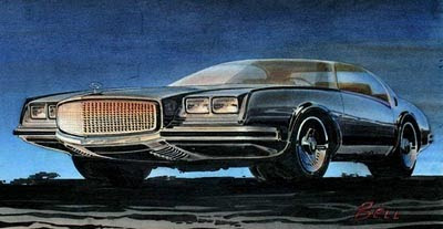
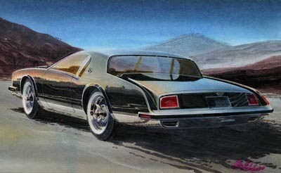
These 2 GM sketches are from the late 70’s.
Probably early ideas for the 6th or 7th generation Rivieras.
And actually quite stylish, for the time.
And noticed the exhaust being incorporated into the rear bumper, like so many cars now.
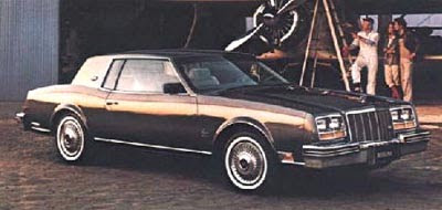
This is what the Riviera looked like from 1979 to 1985.
More stylish than the previous generation that was produced in 1977 and 1978.
But nothing like the early ideas pictured above.
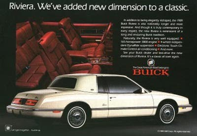
And this was what it became in 1986.
I can see just a little bit of the illustrations in this , but not much.
This 7th generation introduced big changes for the Riviera, including a unibody, a much smaller size and no V8.

I had a gray '79 Buick Riviera, but that white 1986 one doesn't look half bad. I think that most every Buick fan nowadays thinks that the Riviera should be brought back in a modern manner, similar to the recent concept Riviera.
The last picture was not the 1986 Riviera, but the 1991. The 1986 was smaller.
Great find. The dramatically downward sweep at the back of the front door and the rear quarter window would have been cool to see on the '79-'85. The formal roofline of the concept made it to producion and were all-the-rage durring the 80's.
1986 was the year GM loyalists turned to foreign cars in droves. Almost entirely due to the poor design of the smaller, (more european) less sculptured '86 (which is NOT what is pictured here). The White one here was GM's effort to rid itself of the "smaller-foreign-car styling" 0f '86-'88 and get back to it's bigger (& much more sucessful) roots. They made it longer; added a
"broughamn" padded vinyl roof, (white '89 pictured here) and their falling sales suddenly made a u-turn and started back upward. (Cadillac's overall sales continued improving right up to the depression of '08-'09). It's important to remember that cars were still status symbols back then and that unique styling was all-iimportant. (Unlike today; where people buy cars like they buy appliances–which explains the popularity of Accord, Fusion, Camry, CR-V, and all the hatchback econo-boxes) Oh, how I long for the high-class days' when men were men and Cars were Automobiles!
A new dimension to a classic. Really GM? The 91 was actually an attempt to undo some of the damage done with the truly awful 1986 design.
These are just the kind of sketches of outlandish designs car designers seem to like.
No car in that era was ever going to have the 19 inch wheels needed for those proportions. Front grill protruding in front of the bumpers – afraid not. Doors that arent the right shape for windows to retract into. Nope.
If I owned a car company and they gave me those sketches, I think sack the designer and ask for a guy that can draw something that can be built.
No one ever expects an illustration like that to be built. It exists as food for thought. Designers have to have freedom to express their creativity, even if only a tiny detail makes it into production.
My father had a '79, if memory serves, and it was a nice car, but it wasn't nearly as exciting as the Rivs of the '60s and early '70s. But it was still more unique than that bland white model pictured last. That looks like nothing more than a LeSabre with a landau top.
Vince, where are you getting all these "could have been" sketches? Id love to see a whole collection of them.
I have an 89'. It is super classy, red leather interior. I dunno, maybe one has to see it in person; definitely not bland. It had a boxy 80s look with riviera styling that is aging great. I get comments on it nearly every day I take it out, which is pretty much every day. But I get it, to each their own. I love this gen and all previous gens. 8th gen maybe hasn't aged enough quite yet to look unique. Takes a little time.