2011 Jeep Wrangler interior
Last Updated:


Looks like Chrysler is on a fast track to redesign pretty much all of its interiors for the next year.
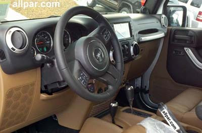
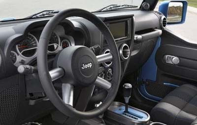
(As requested, I also posted a picture of the current interior.
The top picture is the new one.)
The bigger news will be on the Town & Country, which faces new competition from everyone, and the Sebring.
I still think it’ll take much more than a new interior for the Sebring to pick up sales others than rental fleets.
I guess it’s better than nothing at all…
On another note, I find strange that we never hear about the next 300. It’s been rumored to be “around the corner” for a while.
While we’ve seen the Volt and Cruze for years, the Next 300 is nowhere.

although this interior is still outdated and subpar- it is light years ahead of what it replaces.
The problem is, Chrysler has been going BACKWARDS in interior design over the past 10 years – this this "leap forward" brings them off to about 2004.
I do wish them well and am really rooting for them.
Vince, we really love it when u show the old and the new on top of one another, it makes it so easy for us readers to see the differences, and compare the new with the old ! (no other blogs do that) now i gotta go surf the jeep site and see if i can even remember what the old one looks like 🙁
Okay.
Anonymous #2 said it PERFECTLY. No one else shows a side-by-side comparison, and the fact that you (usually) do is (and would be) greatly appreciated!
Both of these interiors are unimaginative and cheap looking. What about the use of unique materials? Collaborating with Nike or some wetsuit brand for seat and dashboard materials? Where's the industrial grade looking switchgear? Where's the military-style NASA designed air vents? Where's the goddamned good design? This is more cheap silver painted plastic tupperware trash. That tan lower dash and floor console resembles an 80s K-Car. A 1990 Wrangler looks more durable and purposeful than this. How can a company get it so wrong so often?
Specific to the 'cheap looking materials' comment…I actually think a 'traditional' jeep SHOULD have cheap interiors!! They're easier to clean. A tradtional jeep owner will be in the mud, leave the roof off and want something that they can easily wipe down. I actually think this is a step backwards (based upon these pictures).
Chrysler is junk.
Who cares what they are doing. Mark my word, they won't survive another 10 years.
Talk about unnecessary. Wrangler sales INCREASED 16% in the first half of 2009 (when GM & Ford both dropped 40% and Toyota dropped 60% in Truck sales). The Wrangler really has no equal. It's off-road prowess is so far ahead of even Land Rover, FJ Crusier, Land Crusier, & Hummer, that there's simply no comparison. Even Dodge PowerWagon (with detachable front axle) is clearly SECOND to Wrangler. So I guess the "almost perfect" off-roader is now "Unquestionably Perfect". The new dash is just icing on a cake that's already buried in icing. (It does look nice though!)
How can you deem the interior "outdated" and "sub-par" from a pre-production spy shot? You can't even tell if all the parts are grained or if this isn't simply a non-running model. (Somebody sounds a little bitter!)
Whatever the outcome of the product, the undeniable reality is that Chrysler is back to pumping money into product and most importantly, actively working to correct their mistakes.
The purpose-built Wrangler is an icon of American culture. I think the look of the interior reflects the honesty of it's intended use: in the friggin mud! It doesn't need some pretentious toggle buttons or trendy poser materials. Most of you people drive Hondas and Toyotas. How imaginative!