All new jaguar XJ “hands on”.
Last Updated:
I have to say, in real life, the car is pretty stricking.
And it’s big.
But after the 1st impression, here are a few things I noticed about the car.
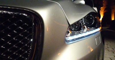
I saw this on all the pictures I’ve seen of the car. The cut where the hood matches the headlight and the top of the bumper is pretty sloppy. The hood part seems to stick out a bit. Something you almost never see in any car today.
And not acceptable in a car of that price.
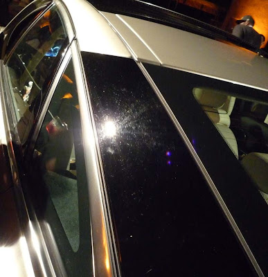
Those black panels around the rear window look as bad as in the pictures.
There are no reason for them. It makes the car look cheap and unrefined.
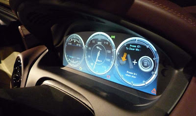
There are no dials in the new XJ. They are replaced by a flat screen.
It looks horrible. And again, cheap.
Like a video game. It has no place in a classy car like the top of the line sedan from Jaguar.
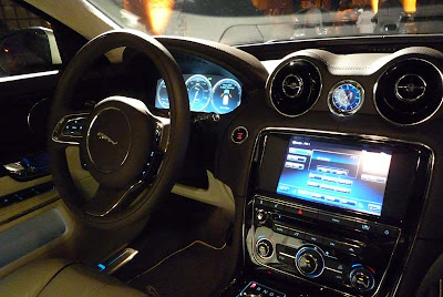
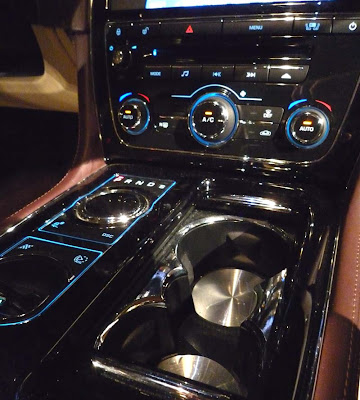
The interior seems very impressive. At first.
But soon, you notice that pretty much every line in the design is accented by a chrome piece.
There is such thing as too much chrome. Everything shines, everywhere!
It looks like a Las Vegas bar. And it left my with a feeling of vulgarity rather than luxury.
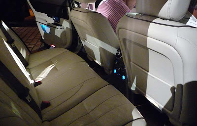
The back seat on the regular version isn’t that big.
And the doors although solid, do not have that bank vault feel and sound many expensive cars have.
I was disappointed in the new XJ. But really, it was pretty much what I expected from the pictures.
None of the problems are solved by seeing the car in real life.
The interior was actually worse than I thought. It has that “poor person idea of luxury” feel to it.
Exactly what a Jaguar should NOT be….

I really can't think of any car I want to fail, however, I wish this car didn't exist. The original XJ was a plush gentlemen's luxury car with balls. The word 'subtle' comes to mind.
I think Jaguar took a beautiful niche car and ruined it with this overhaul. You're impressions only seem to solidify that. What a shame.
I think if Jag would have used a black background for the gauges, instead of blue, it would look much better. The MB S-Class has the same type of gauges but look a lot nicer with their black background. Same thing with the ancillary gauges on the Ford Fusion Hybrid, which again use a black background.
damn Vince, I gotta agree about that hood shut-line… it looks terrible. That would be unacceptable on a 1/18 model of the car, let alone the real thing. Ouch.
I don't mind the blackout pillar as much as other people — I'm sure it'll grow on people. If there's one thing we know about Ian Callum, its that he's always right!
And regarding the interior, looks like you had a car with the Piano black trim. That probably added a good bit of shimmer to everything.
Okay.
Ouch…talk about a scathing review. Was there anything you LIKED about the car?!
You aren't kidding about that dash looking like a cheap Vegas bar. Maybe circa 1968 – one that should have been demolished by now.
Leisure Suit Larry would love this car.
Reminds me of the gimmicks and miscalculated departure from any hint of Jaguar's styling legacy of the XJ40 in the 80's. This ain't gonna be the car to save Jaguar; if they survive, it will be in spite of this one.
Sad to watch a real legend circling the drain.
Jaguar lost it's class long ago. These things are just stupid looking now…might as well be chinese.
You could tell at the Frankfurt Motor show how little confidence Jaguar had in the rear end styling of their own car. Instead of being on a turntable, as every other new car at the show, they had it with the back against the wall, and since it was a closed stand (as always), you couldn't even get a glimpse of the rear unless you asked for permission to walk into the stand (which I did). Besides, the car they had was black, so the panels would be less noticeable.
Thanks for your honest, no bs opinions. That shutline is horrible. How on earth have no other car journalists commented on it??
this car is something the stupid and posh brits.
everything you said is spot on.
hood, the dashboard, chrome.
i think the car most probably looks even worse in person.
i'd rather drive a TATA NANO than a TATA/JAG XJ.
Vince: I have to agree with your observations. I absolutely HATE that blacked out D pillar!
The problem with the last car was it was too bland. With this re-design at least they took a risk. I guess Jaguar's buisness model is to remain a niche brand and avoid competing directly with the Germans.
I saw this car in person in Dallas on Tuesday. It's making the rounds at the dealers. The car I saw was black and as I had hoped, the blacked out pillars fade away and it looks great. I wouldn't have it in anything but black. I however felt the rest of the car was pretty much sex on wheels, which is what Jaguars should be, IMHO. I thought it was fantastic and I only hope they continue to have poor resale value so I can buy a used one in 3 or so years! LOL.
Looks super ugly and I guess its because its not British anymore as it is Indian car company now.
and Indian car sucks….
I wish they never make it our shore..
Buycott them…
Yeah your review was harsh, but watch the bastard sell. Hell Neiman Marcus sold their 50 collector editions in the the first 4 and half hours. I have seen this car in person. It is actually nice. Ok so the hood shut line is awkward true, but unless you are tongue kissing the grill who gives a f__k!
The dash is a technological advance, I love. Maybe not as refined as my 7 series with the blacked out dash. But I do love the computerized LCD dash. Vince you took pics of the interior with the piano black finish. So the reflective surfaces make it look cheesy. The one I saw had a low gloss wood trim which looked really elegant and it was an XJL model.
The blackened C pillar to me is the only major "what the f__k" moment on this car! It's okay I understand it though Ian McCollum was high when he made that decision.
lol you mean Boycott not Buycott
This is the short wheelbase model; for people under 5'5". Most Americans will want the longer "L" versions.
I assume that the basic car was finalized before TATA took over. But I have to say that the finishing details are so vulgar and garish and completely unlike anything British that I've ever seen, that this must be a result of Jaguar's new owners. I know that Jaguar doesn't use Smiths gauges anymore, but this is ridiculous. The gauge cluster is simply a tablet PC slotted into the dashboard… it could have been very impressive but it just looks like something you'd see in a kit car. There are so many overwrought details, bright lighting and reflective surfaces that I'm having difficulty taking it all in. Don't even get me started on the exterior C-pillar, which is completely goofy and has awful hairline scratches in these pictures. This is a caricature of what someone thinks a luxury car ought to be. Good gawd!
On the other hand, I was behind an XKR today. Total sex on wheels!
What's so disgusting about this is the interior. Let's face it, the interior is what makes a Jaguar a Jaguar. I can get past that terrible black exterior c-pillar, but the rest of the exterior is beautiful. However the interior is unrefined and childish. Part of what makes an IWC watch so amazing are the delicate hands that are part of a mechanical movement. If IWC or Panerai ever went to an OLED screen as some sort of a lazy shortcut, they'd be done with and out of business. This is the same thing. To slap a cheap calculator display onto the dashboard is a very… well, Indian IT way of thinking. TATA needs to sell Jaguar back to Ford, or anyone else who knows what the hell they're doing.
Would that dashboard be visible in daylight? Also scares me that if there is a glitch you would have no screen or gauges? I can't afford one, but that is not this poor person's idea of luxury. I like the leather, though.