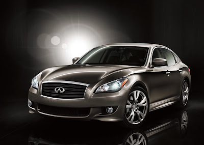
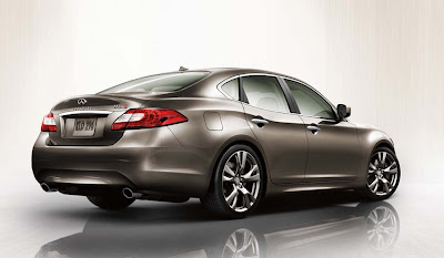
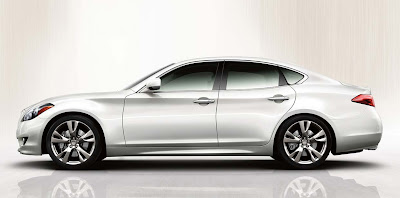
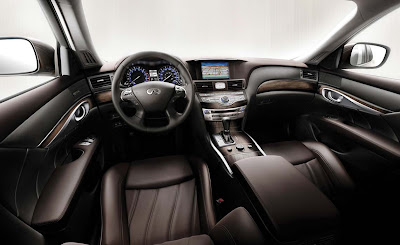
2011 Infiniti M
Last Updated:


We’ll get to see the real thing is December. And it goes on sale next spring.
There will still be a V8 version available in the US, the M56. On top of the regular M37.
Europe will be getting the all new 3.0 Liter V6 diesel as well.

Okay.
*Buick side profile (current/next gen LaCrosse)
*Suzuki Kizashi rear end
*Subaru interior
Not impressed.
I don't like it. They're trying too hard to be 'organic' in the appearance. This ALMOST ruined the look of the G (the original is still the best looking G).
I'll pass on this – give me a CTS / 5 Series / TL instead….better quality; better lookings – and likely cheaper.
r tgu tgis is so ugly i dont even know where to start plus the quality ill never match cadillac or lincoln true classy rides with an un b history this is just another ugly one form the land of crap
"*Buick side profile (current/next gen LaCrosse)"
Yeah okay, this is pretty much a larger version of the G37.
GM is the one that took the side profile of the Infiniti G and used it for the Opel Insignia/Buick Lacrosse
I like the rear end. But that's the only part of it that looks new. The front and the interior is just tired.
Looks like a RWD Maxima (like a cross between it and the current M) from the side, front looks nice, the rear is a dissapointment (which means it will probably grow on me…like the Taurus).
They kept the Infinity center dash/consoul and added 2011 Chrysler 300 to either side of it and down the doors: so far so good. Front & sides are well done. Rear end is generic and betrays the origionality that Infinity owners have come to expect. Overall it's still somehow less than Infinity usually provides; but still so far ahead of Acura/Lexus that it probably doesn't matter.
Okay guys lets talk design, its a little leap forward for Infiniti its evolutionary not revolutionary. They did a good job of blending the Infiniti Essence concept in this but its simply not enough departure from the current model.
The rear is the biggest impact for this car. Its nicely done but thatts because it harkens Jaguar XJ/XK plus Mercedes CLS tail lamps undertones. The nice touch to this is how the roofline integrates into the rear deck, Infiniti should get points for that.
The side profile is nice, and yes it does remind you of Buick, but it adds a flowing kinetic design element to it. The crease on the side is a nice touch from keeping it slab side look as well.
The front is a bit of a let down, its almost as if they mated the G37 headlamps and wide mouth FX grill on to it. And since Carlos Ghosn decided they would not produce a new Q sedan, this has to be Infiniti's flagship/halo car…..more design effort should have went into it for that reason alone.
Face it guys we can do the blame game all day on what company took what from what car, to be honest the Jaguar XJ is about the most Original car design to date….and many on this blog site bashed it for one reason or another. So can you blame Infiniti for shopping around looking for influence for new design in what works and sells.
The interior is also evoutionary and not a huge departure from the current. To be blunt only true fans of the existing Infiniti M will find this stunning in every aspect. If you didn't like the current M, chances are you won't like this. So basically if you like it you like it, if you don't words from Infiniti….up yours! this is what you're getting…..end of story.
P.S. It would make a good challenger against the upcoming Hyundai/Genesis Equus.
OK…
Model T door handles
Bugatti rubber tires
F150 light bulbs
Ferrari lug nuts
Jaguar speedometer needles
Not impressed
The only weaknesses of the current M are the hideous tail lights and the boring standard wheels. Otherwise, it is a highly rated sedan and this new design will raise the bar for everyone else. It is definitely on my shopping list, since my 07 G35 S has turned out to such a treat. I hope though that when I see the new M in person, it will not disappoint me like the current FX, which is too much on your face.
The message I have for Infiniti is that their cars should look great with the standard wheels on, and not boring. The bigger ones, should simply make them look gorgeous.
The concept was beautiful. They sure bastardized that! The interior does look like the Subaru! Wow! Hope they replaced the paper thin wood on the current one!
According to these initial shots, I would prefer if Infiniti had brought to the market the "Essence" concept exactly as it was in the concept form. No this.
If the money is close, I would rather take the new Hyundai Equus. The Equus looks much, much better both inside and outside.
Terrible taillights. Although if this is what getting smoked at an intersection looks like, !@#%& it. It will kill.
But my professional design opinion? Who stuck the sedan in the microwave? It melted.
I seem to like this. Although it might not be for everyone, still, it looks good to me.
I'm interested in seeing more pics with better resolution but so far so good.
This car looks like a larger version of the G sedan and that's a good thing. The interior looks great. I hope it's higher in quality than the current one.
After seeing the HOT Essence, this car is a HUGE DISSAPOINTMENT in the styling department. Who within Infiniti said, "Make the Next M look like a Buick LaCrosse?
Walk like a….. Hyundai Genesis!!
Q: Does this redesign make me look fat?
A: Yes. And old.
Now that I've taken a long look, the rear end is very reminicent of the 1997 Q45.
It's a really busy design. Too much going on.
It's not awful. But it is nearly invisible and I can't imagine anyone seeing this and adding it to their shortlist. And I feel like I saw something similar this morning… the half used bar of soap in my bathroom. The engine had better make up for what is a very staid design. Although 400hp is very intriguing, that it just might.
Okay.
*Buick side profile (current/next gen LaCrosse)
*Suzuki Kizashi rear end
*Subaru interior
Not impressed.
August 15, 2009 11:14 AM
OK…
Model T door handles
Bugatti rubber tires
F150 light bulbs
Ferrari lug nuts
Jaguar speedometer needles
Not impressed
August 15, 2009 4:30 PM
You also forgot.
The Great Wall Motor Company wiper blade rubbers.
Not impressed
exactly what I expected to hear from the jealous poor people who could never even sit in one. unless of course they are vacuming one out at the detail shop they work at for minimum wage. anyway, now that we have the losers out of the way. I would like to say that this is the new king of all sedans. a bit of bently in the body creases and the interior , and alot of classy infiniti on the rest. a home run…..wonderful work Infiniti/Nissan
A Bulbous joke…Looks like Michael Moore's fat slob face.
class act said…
"exactly what I expected to hear from the jealous poor people who could never even sit in one. unless of course they are vacuming one out at the detail shop they work at for minimum wage. anyway, now that we have the losers out of the way. I would like to say that this is the new king of all sedans. a bit of bently in the body creases and the interior , and alot of classy infiniti on the rest. a home run…..wonderful work Infiniti/Nissan"
August 16, 2009 2:32 PM
**Look everyone, we have a Nissan saleperson on this blog**
what?!?!!? i seem to be the only person who thinks that this looks spectacular
"exactly what I expected to hear from the jealous poor people who could never even sit in one…."
Meow!!! Sounds like someone is taking this awfully personally. Lighten up. I think this looks uninteresting and will probably sell about as well as the current one. And that's not a good thing. Too bad I'm just pooooor and don't get to have an opinion!
I am not impressed in the least. That rear end is awful, as if the front. The side profile is nice, but the entire vehicle is too bulbous. Looks like a bar of melted soap.
"class act said…
exactly what I expected to hear from the jealous poor people who could never even sit in one. unless of course they are vacuming one out at the detail shop they work at for minimum wage. anyway, now that we have the losers out of the way. I would like to say that this is the new king of all sedans. a bit of bently in the body creases and the interior , and alot of classy infiniti on the rest. a home run…..wonderful work Infiniti/Nissan
August 16, 2009 2:32 PM"
Fanboy much?
I could buy one if I so choose, but I wouldn't buy something that doesn't impress me in the least. I need a worthy competitor as a replacement for my 330.
I see no Bently in this design at all, nor will this be the "king of all sedans". What an idiotic comment.
Nissan tries WAYYY too hard and they aren't sucessful.
"Meow!!! Sounds like someone is taking this awfully personally."
May be we are getting too serious here, but, when some of you give a thumbs up or down to a particular design, can you also tell us what car you are currently driving? The real one, and not the fictitious.
you may not like the style, but infiniti does make pretty great cars. if you don't like it , Then don't buy it……simple! I am getting one.
Vince, what are your thoughts on the design in these pics so far?
I'm not crazy about the front end styling, but I think the side profile is very nice and the rear although kinda generic looks way better then the current car's chopped off design.
The interior is the best in class. 5/7 Series and especially the C Class simply cannot tough this interior design. Although not perfect, overall I think this is the best of it's class as far as design inside and out is concerned.
"but infiniti does make pretty great cars. if you don't like it , Then don't buy it……simple! "
The G series is a great car and so is the FX. But the M has continued to struggle along with their Q. I don't like this new M and I won't buy it. It hasn't evolved far from the last M, and still looks like a soft blob with a heavy rump. Before this, I'd take any number of Audis, a CTS-V, a Lincoln MKS or even a Volvo S80 to be quirky and for the great interior. Hell, I'd even take a Taurus SHO. At least with the SHO there would be no failed attempts at pretense like with this.
" if you don't like it , Then don't buy it……simple! I am getting one."
August 17, 2009 7:43 AM
Well a big thumbs up to you.
Good on you.
Sorry, this looks like crap. There is nothin prestigious about this design or vehicle.
Looks like a Hyundai.
Wait…What…If I don't like it I don't have to buy it!!! Since when???
I am REALLY not feeling this 3rd gen. I actually strongly dislike it. Exactly like others have said, it is far too bulbous and the interior looks like they are trying too hard to be different or something.
This is an ugly car. The only nice looking Infinity is the G37 coupe.
Yeah, this looks like absolute crap.
Absolutely useless.
This is a horrible car.
I'd rather have a Genesis 4.6 and save over $15K.
I'd have a longer warranty and I honestly don't care about a badge. If you have to worry about a badge you are a prick anyway.
Now why isn't nobody saying what it looks like? If it were a Hyundai you guys would. The side profile reminds me of the Chevy Impala or older Subaru Legacy. The new Legacy reminds me a cross between the Infinit G sedan or Honda accord. Come on you guys talk about Hyundai's desings lets start with everyone else. Like the VW Icroc concept and Tundra and Lancer's face.
August 19, 2009 3:03 PM
Refer comment. August 17, 2009 7:39 PM
A friend of mine, who buys a car every year like clockwork, recently traded his Infinity M in on a Hyundai Genesis. When I asked him why, he said: "I thought it was time to move more upscale, and it was a toss up between S-class, A8, 7-series, and this. So I hageled with all four and went with the best deal." (Apparently he's not that fond of Lexus's styling). I guess Infinity needs to be more creative (than this) to hang on to past customers that were drawn by the uniqueness of the current model.
I'm disappointed with this update. I really liked the previous model as it looked muscular yet graceful, but every line on this has a bulgy flow to it. I'm reminded of a hyundai sonata.