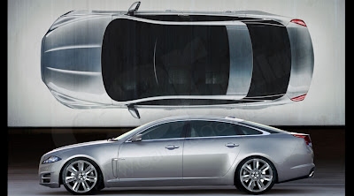
2010 Jaguar XJ Illustration
Last Updated:

From “Car”.
It does look much better than what we saw a few weeks ago, when someone else tried to guess the car from the official teaser.
I still think the black rear pillar looks a bit weird.
We will see the real thing next month…

Clean. What the Audi A8 use to be.
Ugly chopped Audi.
Looks alright but those slab sides and gun-slit windows do not make for a good cabin experience. Unless one likes sitting in a bathtub.
This chop may or may not be based on the Audi A8…either way, this looks MUCH better than the previous chop.
It gives me hope!
This can't be the XJ. The XJ has been distinctly similar for the past few decades and this looks completely different.
That is flippin beautiful.
I love the current XJ. It is a classic beauty. But I understand taht Jaguar finally has to go on. The XF is a beautiful example of what a modern Jaguar can look like. But this "guess" for the XJ looks definitely not good, at least for a Jaguar. I also see just a longer and flattened Audi A. Sadly, this is not enough for a new Jaguar.