All new Mercedes E Class Coupe
Last Updated:


Finally the real thing. After years of spy shots…
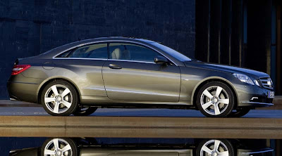
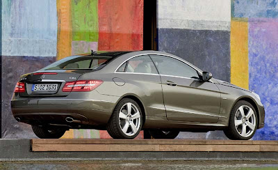
I think it looks much better and classier than the sedan. Even though most of the lines are similar.
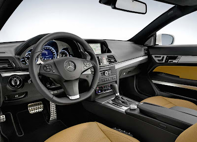
It’s just too bad about that blocky interior. It just doesn’t fit the rest of the car.

The interior has moved from the 80’s to the 90’s. Well done.
Looks pretty great.
it needs more curve-appeal on the interior. right now, it looks like it belongs in a glk and not in a more expensive e-class.
What is with the BMW dashboard and the GM /Pontiac steering wheel ?
That interior looks like from a child with a straight edge.
when are they finally gonna show a pic of it with all 6 windows down ?
Whats with the stupid quarter window above the fuel filler??
The proportions of the exterior bother me. The doors look too small compared to the greenhouse. The interior isn’t as bad as I thought it would be, but that’s not saying much because I pretty much expected it to be an abortion. This isn’t an abortion, but this child was born with some kind of deformity…
For a minute, especially the photo on top, I thought I was looking at an Accord coupe. Hmmm…
For a minute, especially the photo on top, I thought I was looking at an Accord coupe. Hmmm…
For a minute, especially the photo on top, I thought I was looking at an Accord coupe. Hmmm…
That IP is more appropriate for an AMC Hornet. It’s just hideous. It’s neither dynamic, inviting.. It’s just bad.
Id rather have the hyundai in the above picture.
Maybe I’ll like it better in person. That’s the way it was for me with the current one.
That interior is just plain No-Class
THat dash is sociopath freaky…Who designed that? Hannibal Lecter?
Go look at many of the interiors for both MB and BMW, these interiors all have that stark, squared off look represented in this picture. For some reason this is considered upscale in Europe, where the U.S. and Japan lean toward the swoopy,archy look.