2010 Lincoln MKT
Last Updated:
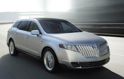
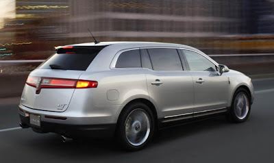
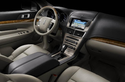
Here it is, the Ford Flex based Lincoln. With its own design and interior.
A nice looking 21st century Lincoln. 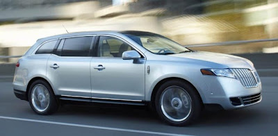
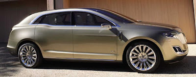
Here you can compare the production car with last year’s concept.
I saw the concept myself and loved it.
As you can see, the production version is pretty close. But as usual, perfection is in the details. And some of these details and proportions that made that concept so good looking and special are not there anymore…

that is really weird
too much front overhang and the Taurus has a much nicer interior
That has to be one of the ugliest vehicles I have ever seen. I like the new Lincoln grill on their cars, but that is homely as sin. The Flex is a better car in every sense of the word, from what I can see from these pictures. Terrible.
It’s fantastic!
Theconcept is good, but the final product takesa people mover to a new level. When you see one of these on the road, you will strain your headto see who makes this thing?
It seems to only come up short from the C-pillar windows backwards compared to the concept.
Pure American design.
I just threw up in my mouth a little.
that is AWFULLY UGLY
why are american cars so much less successful than the rest of the world? its DISGUSTING
This is the most retarded thing I have ever seen…This came from a human mind?
I dont understand, short-bus people cant afford this.
Looks menacing at the front like the BMW 530 wagon, but the back side is still a let down…
I really like it as well.
Of course it isn’t going to have 24″ wheels Vince, and of course it is going to have door handles and a toned down front end.
What in the hell did you expect???
It has a some unique qualities but the Oldmobile Cutlas grill is just too big.
Wow this looks beautiful! I’m glad that this has a personality of it’s own instead of just a Flex with a Lincoln badge. I think Ford learned from the days of the first gen Navigator. I don’t even mind the rear which screams “Return of the Mk VIII!!!” It’s very nice and fits neatly between the MKX and Navigator.
looks like those British funeral cars. terrible.
People seem opposed to change.
Its not bad at all.
Change for change is not really change at all, just look at the current and future president, they have agreed on everything so far, 700 Billion, Auto bailout, military leader etc etc……..
This is just stupid looking, big and will do nothing for lincoln.
Man, it’s just so big! I don’t think it’s horrific, but just seems bloated.
This is laughably ugly…The designer must be getting kick-backs from Toyota.
Im kind of disappointed…..the concept was more Infiniti FX crossover…….production is more wagon.
This is your brain on drugs.
They blew it by eliminating the thick D-pillar, now it looks too muck like a station wagon. It’ll make a great hearse!.
Its hideous…Oh, come on…Its just a donkey.
It sure has taken a long time for people to warm up to these tall wagon “Chrysler Pacifica” type cars (crossovers?)
oh my god the exterior is so ugly and clumsy looking. looks like it was designed by a committee.