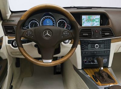
Mercedes Concept Fascination interior
Last Updated:

This is supposed to show us what the new Mercedes CLK will look like.
So I would think the dashboard is pretty much production ready.
There are also rumors that the new CLK might also be sharing this with the new E Class.
This looks much better than all the interior spy shots I’ve seen of the new E class.
But again, this might just end up in the CLK.
We’ll see…

This is the clumsiest, most cobbled-together parts bin design I’ve seen on a concept car in a long time. The brown air vents and upper dash/nav combo are Chrysler-worthy. I’m beginning to think that MB had a really negative effect on Chrysler, and not vice versa. There’s no excuse for this in 2008. Possibly the worst concept interior ever.
Um no. When are car interiors going to get into the 21st century. This is like a cassette player in the digital age.
Wow this is so ugly. Disgusting brown, horrible cheap-looking wood from the 1970s, and a horrendously cheap and ugly steering wheel. This is amazingly bad.
The center stack seem a bit too upright.
i’m sorry but no. this is simply one of the worst interiors i have ever seen. and so much worse than the current interior
SUDDENLY IT’S 1971!!! Not that MB has been a leader in classy interior (or exterior) design–ever. But this is laughable. I’d gladly pay an extra $10grand++ for Cadillac Style.