Please make them stop!
Last Updated:
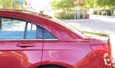
Someone need to get the message to design studios around the world that the little fake window behind the rear door just doesn’t work.
It always looks like ass.
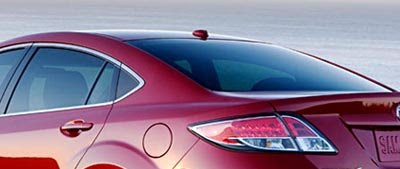
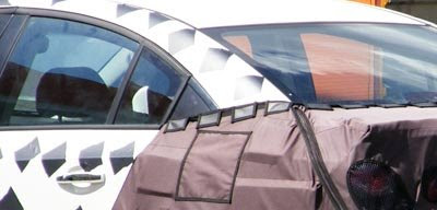
It looked assy on the Sebring. And it doesn’t look much better on upcoming designs like the Mazda6 or the new Chevy/Daewoo Cobalt.
There is no way they can pass this horrible looking black piece of plastic for glass. Maybe it looks OK on some press pictures. Like the photoshop work on Madona’s face. But it never looks good up close. Again, just like Madona’s new face.
Let’s just hope the Chevy will be the last one to use that cheap looking trick.
It never fools anyone….
Chrysler Sebring
2009 Mazda6

Chevrolet Nubira(Europe)/Cobalt(US)

it works on the chrysler that is a good looking v c ar
It doesn’t take away from the Mazda…
I agree, it’s a cheap trick. It’s usually not the designer’s original intent, you’ll find that on the original sketches the doors (and wheelbase) are probably longer but when they try and squeeze rear passengers in they have to raise the roof line a little and to get those proportions back the rear quarterlight gets pushed behind the door. When it’s real glass it’s fine but a piece of shiny black plastic looks terrible. At least on your examples it’s shiny – have you ever seen a Suzuki Liana..
If they find out that the proportions aren’t right in the translation from design sketch to actual vechicle, if they HAVE to keep the same shape, why not just make it glass?
I SHARE THE FRUSTRATION!
I don’t think the total intent is to make it look like a peice of window glass.
Imo, in some cases it’s to aid the DLO design, nothing more.
each to there own i don’t see it making these 3 cars ugly.
I’m really sick of that too. Especially the huge amount of glass on the outside and inside there are dinky little slits of window on the sides and back. Toyota is really bad for this. Note the new Matrix on the C pillar. There is almost no real window there with terrible visibility but on the outside it looks like huge amounts of glass.
i agree it can look bad like in chryslers usual poor execution, but i think it may look ok on mazda 6
I can’t tell form the pics of the new Cobalt if that is an actual design decision, or part of the cars disguise. The trim in the offending area does not really match the rest of the cars trim. So either this is a very egregious example, or it is disguise. Let’s hope for the later.
I agree with the Cobalt’s window treatment possibly being part of the camouflage. Let’s wait until we see what it really looks like. At least Chrysler looks like they’re redesigning the C-pillar of the Sebring to remove that ridiculous-looking plastic panel. It doesn’t look as bad on the Mazda 6 sedan, which seems to relate to the hatchback, but again, why not make it glass? The design feature I’m really tired of is making the window area of cars as small as possible so it’s practically impossible to get a good 360° view out of your car. Whatever the hell ever happened to open, airy greenhouses?
That thing on the Cobalt/Nubira looks integrated in there…and poorly executed. I think this is part of the real deal for this car…sadly enough.
imho the Sebring looks like garbage – the HOLE car (intentional use of “hole”) …
the Mazda6 looks very very good …
jury is still out on the Chevwoo …
the problem is these designers (OR the ‘suits’ who determine what gets approved!) are starting from designs that don’t fit the role the car is meant to fill. If they’re building a sedan/familycar, forget the hot coupe look – just leads to trouble.
back to the Mz6,
imho the problem here is a bit different… making the sedan and hatch match AND making neither look completely like a hatch == DUMB! (not that Mazda is the only one doing this – see many sedans with near-fastback rooflines & their tiny trunk openings).
also in my experience, C-pillar window-lets don’t do a darn thing for visibility – by the time you take into account the thick frames needed for crashworthiness…
just make the fixed rear portion of the reardoor window big enough for good entry OR make some of the C-pillar part of the door.
*end disjointed rant*
I think it aids the design in some cases like the Mazda 6. It finishes off the design, whereas if it was just cut straight down i think it would look odd given the curvy, shapely figure of the 6…
But at the end of the day does it really matter? There are more important things then ill used black plastic…maybe someone could commission a study of how much black plastic is wasted in these instances and how much energy we could save if car makers didn’t incorporate them…
“I think it aids the design in some cases like the Mazda 6. It finishes off the design, whereas if it was just cut straight down i think it would look odd given the curvy, shapely figure of the 6…”
That doesn’t hurt the Malibu at all…
Well, they could just use a Hofmeister kink and don’t have to pay for extra glass. Can they really be cheaping out on buying that last tiny bit of glass?
The Lincoln MKZ also had a smaller version of these plastic pieces to change the “Fusion window line”.
Some styling tricks with bright metal window frames around windows shaped a bit differently are OK if not too prominent.
The Chrysler Sebring is horrible IMO and the Mazda 6, while a better style, still looks cheap because the painted area is so large. I think the Sebring would look much better without its ugly plastic “C” pillar patch.
I really wish car designers would stop that unnecessary and silly crap.