Dodge Challenger production interior
Last Updated:


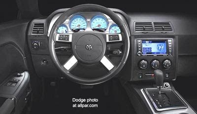
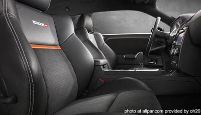
Looks like they didn’t want to spend that much money on a really cool interior for the all new Challenger.
While the exterior looks almost exactly like the concept, the interior just looks like a modified Chrysler 300. Which is pretty much what it is….
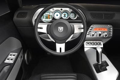
As a reminder, this is the concept interior. Which wasn’t that crazy looking to start with.
At $40 000 the SRT8 model is pretty pricey. You’d think they’d give you a more interesting interior.
At least give it its own steering wheel!

The main thing here is everything that is needed is there and it looks simple and clean. Most people that are getting one want it because they grew up seeing them or driving them; meaning they don’t want it because it has iDrive, 5 different colors on the inside, or that it looks just like the concept interior. Almost everything in the concept is there minus the switches under the radio. It looks classy to me compared to the Mustang…I guess that is because it has similarities to the Charger and 300C.
Looks better than the interior of the Nissan GTR.
I guess Dodge felt that with the high price of gas, people wouldn’t be spending too much time in their car.
Well that interior is very disappointing. So regular and not much jazz.
HUGE mistake. I actually really like this car and want to buy one, but now… not so sure. That interior is *garbage*. You can only cut costs so much without compromising the integrity of the design and its appeal to customers. I was horrified when they switched the Charger interior over to be nearly identical to the 300, and now this…. Dodge, what gives? Get your act together!
The interior looks a lot better than the new Camaro.
Chryslers interiors are simply uncompetitive. They have to be the worst in the industry. It will take years for them to catch up because any new design takes about 3 years to make it to showrooms. I took a good look at their newest vehicle the Frontier and comparetively speaking, its a joke from a appearance standpoint. Their future is bleak.
Parts Bin, thy name is Challenger.
That steering wheel bothers me most of all. I’d take the one on the prototype. This one doesn’t say “sport”…it says “dork”!
My heart just sank. Not good. I don’t know what else to say.
That steering wheel bothers me most of all. I’d take the one on the prototype.
I agree. Give us the concept wheel and a more shapeliness to the center stack. Nav screen that pops up from the dash would have been better, too.