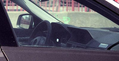
Next Mercedes E class interior
Last Updated:

I know you’re not supposed to judge a car from a grainy spy picture.
But this dashboard (or what we can see of it) looks really horrible.
Is something that square considered upscale now?
(these cars start at over $50 000!)
It will be 2008 by the time this thing comes out.
This looks like 1978…

Before I even read your “1978” comment I was thinking it looks like an ’86 Civic.
If that is real, I think it is an unfortunate attempt to blend the new C-Class and S-Class interiors, and unfortunately the clashing styles results in something like this.
I think that they’re trying to go back to the squarish look of the mercedes of yore, which gave them, in their days, an upscale, built-like-a-tank look. Sadly, it just looks out of place for 2008.
I think it’s a matter of taste…if you look at the last gen W203 C Class..it looks like crap. And look how BMW have gone more curvy with their latest interiors and as a result they just look cheap and crappy. Some of the older Mercedes models with the square interiors still look good. I used to have a 190E and the interior was really solid looking and still quite impressive 20 years later….I guess it’s different in 2008…but at least it’s something different. For people who drove the older Mercs it might be the car for them….square design doesn’t necessarily mean bad design…
c-mon… we are in Wal Mart’s parking lot eeh???
Stick a Mercedes emblem on it and people will swoon no matter what it looks like.
Looks like the designers of the new Accord’s interior are moonlighting at Mercedes-Benz.
Are you sure it’s the interior of an E-class? I believe it’s the interior of their new GLK small SUV. Still, it’s not that great but it fits a little bit better in a truck.
I agree! I do not believe this belongs to the E class. Look at the front windshield swoop along with the larger mirrors on the side along with styling cues seen on the ML. I think this will be an SUV not a sedan.
I had the same comments when I posted an interior pic of the next 7 series.
Everyone said it was the X6 SUV. It was not.
This is the E class. I am 99% sure….
lol looks like a 1980s Hyundai. Doesn’t matter though, people know German engineering and design is far superior to Japanese. There is no way the Lexus GS430 or Infiniti M45 is better than this right? Put that 3-pointed star on the front and the ignorant and uneducated will line up to pay for it. – G
what is the deal with the double hood design?? what’s next? a triple hood so the passenger doesn’t feel left out? terrible … never like it on the bimmer and at least it was rounded there. what with the square look? did they took it right off the ’86-’98 w124 dash and place it here !?