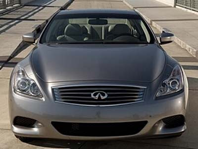
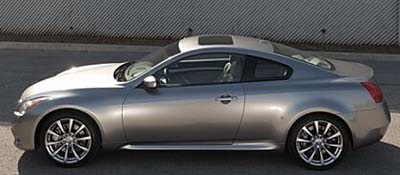
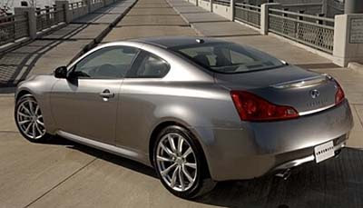
Even better pictures of the G37.
Last Updated:


It does look better, doesn’t it?
Especially without that ugly spoiler from the sport package.
But still, a little chrome line around the glass area wouldn’t hurt. Like on the sedan, or the BMW coupes.
And what’s with the world’s smallest sunroof???
Why even bother.
It also looks like the dash might be the same as the sedan. Not the really cool looking one from last year’s concept.
Too bad…

Wy must you nitpick it Vince? This car is drop dead beautiful. I’ll be lucky enough to see this in NY in April, will you be there?
Why must you nitpick it Vince? This car is drop dead beautiful. I’ll be lucky enough to see this in NY in April, will you be there?
Much better pictures, but that color still leaves me cold. I like your idea of a thin chrome strip around the windows. Leave the bare look to the Z.
Over all a beautiful car. But the hood should have opened all the way down to the top of the grill, because that cut line looks ugly.
Looks like that’s about as big as the sunroof can be. Clearance at the windshield for sun visors to be folded up, and just enough room at the back to store the opened roof section. Not a lot of real estate up on top.
this car is a diamond
It does indeed look better. It just doesn’t seem to be something to get excited about simply because it looks like a refresh. Instead of a sunroof, what about t-top? Hmm…
I do like the car. However I don’t like the way the taillights come up so high on the sides. I guess this car is evolution instead of revolution.
No, I won’t be at the NY show.
Kind of expensive to get there.
I still think they should replace this useless sunroof by something similar to what BMW has on the 6 series. Some kind of glass panel.
wow, can someone from infiniti find some originality. to me, this just looks like a facelift on the old g35. the shape is the same, the tailights are basically the same. the only thing dramatically different is the front and the interior. i think nissan could have just put themselves in a perdicament where people may buy a less expensive altima coupe than this for not only price but because the look relatively the same. boring, yawn……. i expected alot more from this.
I Reckon it is a great improvement over the g35..That looked more like a G35 sedan front with a Nissan Z body. This looks more unique and brings a bit more elegance to the luxury coupe class. I mean just look at the latest designs from Mercedes and BMW. They are so radical that you just get put off.. The only reason THEY sell is because of their engines and buyers with deep pockets looking for an emblem.. Congrats Infiniti great direction shown here.. Sort of like a Jaguar/nissaness about the car.. Love it.. Cheers
The front hood’s bulges really don’t work and the c pillar and rear quarter panel “shoulder” combined with the side view of the tail lights remind me of a pontiac Grang prix. Oh, and the lower part of the front bumper is totally Q45, in a bad way…
Was that too much nitpicking? I guess so but this car is a real disappointment.
…Better looking than the “Z”…Yes, it does need a thin bead of chrome around the windows for an extra touch of class…
“[A] little chrome line around the glass area wouldn’t hurt”
Actually, a chrome line would hurt a lot! What are you, a barracuda? I hate chrome accents. I actually think that it makes a car look cheap. Not only that, after 3-4 years, they begin to look like crap! What’s wrong with using black? It’s a beautiful color.