Audi A5
Last Updated:


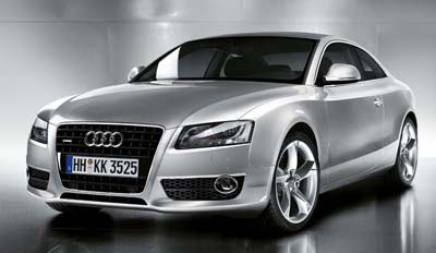
There it is, the all new Audi A5 coupe.
And it looks like any other Audi sedan.
A kind of cross between an A4 and A6 minus 2 doors.
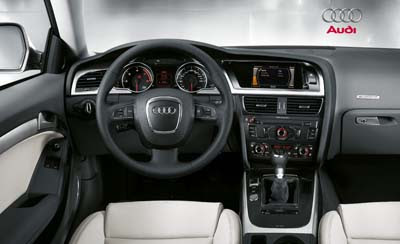
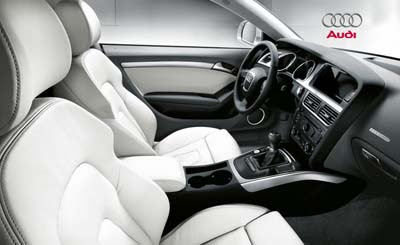
It is classy and the interior looks great. But again, almost exactly the same as the A4 or A6.
I guess that’s enough.
To me a coupe should be much more than a 2 door sedan.
But that’s just me…

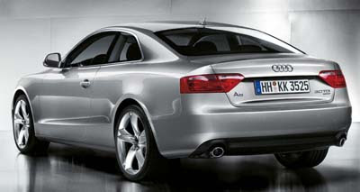
It’s not like any other Audi Sedan: It has a bland front end (why so uninspired headlamps?) and Lexus LS rear lights. I like the wavy crease on the side, though. For me, the interior is interesting since it looks almost the same like in the A6, but technically, the A5 is an A4. Probably it’s the very same thing as the first Mercedes CLK had the interior of the E-class but was based on the C-class.
I have to agree with you Vince. Although it is very handsome, there’s absolutely nothing unique about this car. It doesn’t even look new!
BTW, could someone please explain why they would put a two-part center console(where the verical and horizontal parts are seperate). It reminds of the old american cars that could be ordered with an extra seating area for a third front passenger. It’s sooo ugly.
No ding guards? Better park in the rear of the lot every time!
Another great example of Audi’s understated elegance in design. Much better than the nasty pseudo modern Bangle designs of BMW. This A5 will definately age well compared to it’s competition.
I understand that Audi needed to move on from the original TT design language…but why arrive at this boring, bloated look?
“Another great example of Audi’s understated elegance in design.”
Too many simply can’t grasp the beauty in an understated design. The A5 is so much better looking than what BMW offers, and even better looking than the usual mishmash of styling cues that make up Japanese design.
audi ….be careful! that front fender line swooping up reminds of hyundai santa fe. do not justify their ugly styling by reminding us of them. stay tried and true audi, it works!
I actually really like this design save for the weak front end. Veiwed from profile or rear, or covering up the front end reveals a surprisingly interesting and pleasing figure. It also moves subltly away from previous audi design language of which the pinnicle was the A8. I also like the improved proportions. If Walter Desilva could just do something with that front end!!
It’s got a Bimmer butt.
Its so boring I fell asleep looking at it.
Geeeee – I thought that was an ALTIMA COUPE!!!
love the curves of the sides, but the front end and rear end are dull….
This is a beautiful car. Problem is, I just think that coupes aren’t in style right now. Only a handful of them are successful. Back when coupes meant “sporty” and sedans meant “practical,” this would have made a lot of sense. Not so much today.
very hyundai…ish!