Nissan “Z-Proto”: close to the real thing.
Last Updated:
Although it looks really nice, there seems to be nothing surprising about this new “Z Proto”.
Also, after all these years, this is still ‘just’ a concept. Something that seems popular these days. (Like the Jeep Grand Wagoneer and others)
At least the good news is there will be a new Z very soon.
Powered by a V6 Turbo and a 6-speed manual.
This is a very nice and clean retro-futuristic design. Although who know show the real thing will look like. (This looks very production ready)
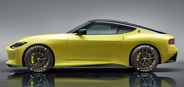
The concept is about 5 inches longer than the current model.
Apparently, this is based on the current platform. This will not be an all-new car. Which is OK, since they won’t be selling that many in our current market.
The interior is a bit bland. With a weird mix of rounded and square shapes. Even though it looks different. if feels a lot like the current 370Z.
No official specs (Except “twin-turbo V6 and 6 speed”. And no dates or pricing yet…
So far, Nissan has done a much better job with this than Toyota with the new Supra. I just saw a couple of them this week, and they look like a tortured mess in the flesh. This is much nicer and closer to what the original Z was. And a real Nissan.

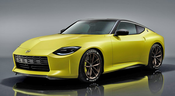
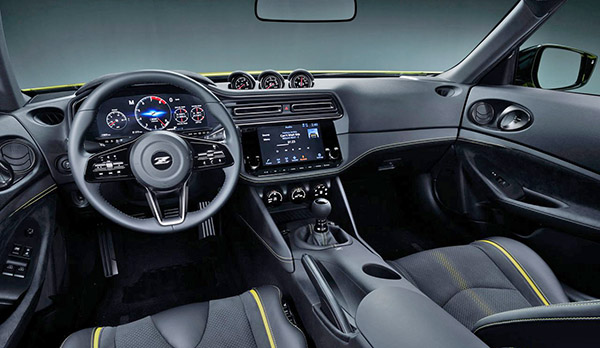
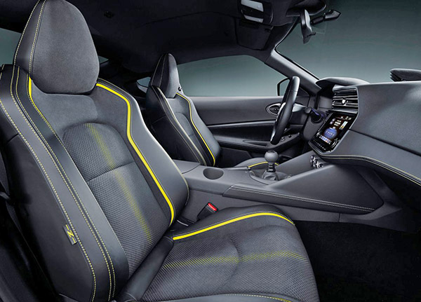
Improvements that would help would be warmer color plastics. An all black cabin isn't that appealing. Americans, myself included also like dual cup holders. The one featured on the center counsel looks silly.
Since the new Z will use the Infiniti's power plant, why not also use its AWD system as an option. It would be a plus for snowy states.
Nissan is about to make it much more difficult for Toyota. Especially after equipping the Z with a manual. The interior is a huge improvement over the 370Z. The large digital tachometer is sports car proper. Just not crazy about the front end styling. Overall though much better and fluid design in comparison to the way overstyled Supra. Can't wait to see it in other colors and see the reviews. That reveal just wasn't that informative imo.
A positive step forward for Nissan, this is a pretty clever retro re-skin of the current 370Z. To my eyes it works better than the current generation car that's all swooshes, angles and weird cuts for the lights and body creases.
The profile view is the strongest, very nice work on the character line starting above the front wheel, hardening over the door and leading your eye to the rear wheel haunches.
The front looks a bit unfinished, maybe too much like the original 240Z,that big rectangular opening seems to be missing something.. maybe once the license plate is mounted it will look better. Missed opportunity to do the turn signals UNDER the headlights just like the 240/260/280Z, they would have added character to that huge, fairly flat area under the headlight
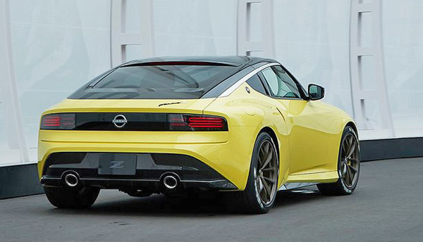
the rear suffers from the current design "trend" — all lines and panels meet where the "bumper" used to be… there's no real bumper and protection from minor parking lot touches. Would need to be extended for the production vehicle. The tail lights are a modern LED interpretation of the 240Z. would have ben a bit better if they had some surface elements instead of being flush mounted. e.g. the insets should have been sunken creating a 3D view . Huge rear window without a wiper? Will this thing never be driven in the rain??
Interior: looks like a refreshed current 370Z interior with screens replacing the gauges and the buttons. Actually simpler and will probably work better. I drove a 370Z a couple of years ago and was struck at how ancient it seemed, felt like I was driving an early 90s car – the tech refresh will do wonders for the cockpit. They even kept the old-school analog dials on top, another nice retro touch! could have done a better job integrating them with the fairly rectangular vents and screen… and… most importantly, IT'S A MANUAL!!! Love seeing that!
interesting design on the seats, not everything needs to be leather, i like the materials used and the yellow shading on the seats. interesting how the driver's seat has a reinforced area in the front between the legs, vs. the passenger seat that's flat.
I think this is a great effort from NISSAN, they need a halo car – keep it close to this concept, offer it bright colors and price it right. $35K should a sweet spot. Anything higher and you are competing with 2+2s that have similar or more power (Camaro, Mustang, etc.) If you get this into the >$60K range (like the Supra/BMW) it won't sell, the new Corvette is in the same price range.. i'd rather have a 'base' Vette than any of the other cars
Looks like Nissan basically copied the "retro" design of the Mustang. Looks way more Mustang than old school Z to me. Kudos to them for at least bringing this to market and with a MT to boot, I guess they are looking to swipe sales from the Mustang which makes sense.
Vince you always select the best photos to display the vehicles- mainly the inteior. Nice work!
I really like that the badge on the trunk lid is placed the way it is. Very retro looking in a good way.
Let the crossover revolt begin!!!
A nice effort despite having to be based on the existing Z platform.. even though many have complained about the front end and grille, my favorite element on the whole car are the radiused lines beneath the headlights that curve up to the edges of the grille.. very evocative of the 240Z! My least favorite (other than the quarter windows that look too much like the 370Z) is the taillight bar.. too thin and mounted way too low! Looks more like the 1995-98 240SX/Silvia taillights than anything that ever adorned a Z.