2021 Mercedes S-Class: early official pictures.
Last Updated:
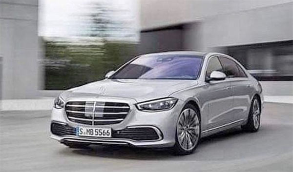
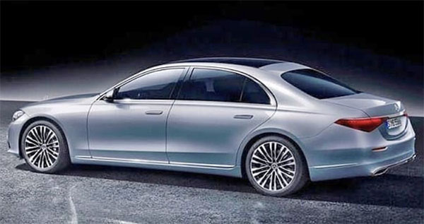
These early pix really show how the new S-Class looks like it could have come out 10 years ago. No one will notice it as an all new design in 2021.
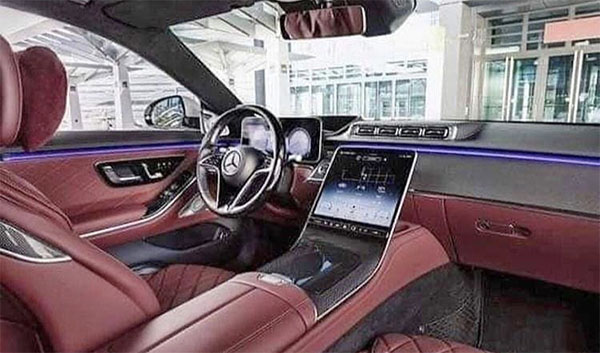
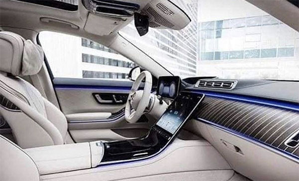
We have seen the interior before. I still think it is at odds with such a conservative exterior. And is basically following Tesla instead of coming up with something new. This looks like what the next-generation Model S (if there is one) could look like inside.
At least on these grainy pictures, the vents on top of the dash look terrible. ( they are not even aligned with the screen right below them). And the overly busy arrangement being the steering wheel seems like such a mess.
I hate to say, but there is a brand new generation Genesis G90 sedan coming out soon, and I think it might actually turn out better than this.
What do you think?

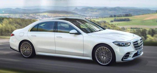
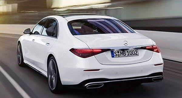
Its a Mercedes S Class…………Enough said.
If 0 to 60 was your sole goal, then you can buy a Tesla. I think this car has its customer base.
The instrument cluster is a joke. Did you leave you tablet laying against the dash. LOL!
Seats look comfy but the LCD's look goofy. The movie project facing up that provides directions and other information, belongs in a planetarium. The center gauges that juxtapose right above the steering column remind me of Walle. Otherwise everything else inside looks great.
I honestly thought it was a Genesis
The shiny plastic square in the grill looks stupid. Yeah we can see it.
The dashboard looks bad for an S Class. The flat screen behind the steering wheel looks cheap and the 4 middle a/c vents look like an afterthought.