2021 Kia Sedona interior: let’s compare it to the new Toyota Sienna
Last Updated:
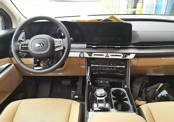
An all-new Kia Sedona minivan is right around the corner. The top photo is the best I have seen so far of its new interior.
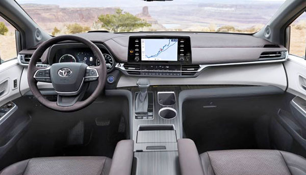
Its newset competiton will come from the redesigned Toyota Sienna. (bottom pic), The new Sedona interior seems obviously inspired by the K5 sedan.
The Toyota seems to have a more conservative approach. With that tablet screen, similar to the RAV-4 and (unfortunatelly) the revised 2021 Camry. While Kia has used a much more elegant design.
Toyota has also chosen to stick with a regular shifter, again, like the one in the RAV-4. Which I really like. Overall, the Kia seems much more car-like than the Toyota. The Sienna isn’t afraid of being a Minivan. While the Sedona is trying hard to appeal to car and SUV owners.
Which one do you prefer?


It looks like a dead ringer for the K5. Since the US K5 never transferred from S. Korea with the rotary shifter intact, I have doubts our Sedona will get it either. Only time will tell for sure though.
Based strictly on these two images, the Toyota looks light years ahead of the Kia in quality and elegance. Kia looks tacky and busy
Sienna. The Sedona is pretty boring without all the flashy colors of the screen. Not a fan of the 1 continuous screen like MB
Elegant. Opinions are like ….. everyone has one.
Sienna, looks more elegant but the Sedona looks good too
The lack of shiny black plastic is an automatic win for the Toyota.
I usually like the single shared screen for the speedo and center stack, but something looks off in the Kia. I will say it's much better than the K5 which recesses the speedo in a horribly tacky black plastic shroud, but still connects it with more plastic to the center stack.
I really hate the buttons on the side of the Sienna's screen though. SUPER cheap looking. Just put them below dammit.
Ah, Vince, still love to screen those comments eh? Sorry for suggesting you actually use a better/professional shot of the Sedona interior that you’ve posted. Lol.
I have realized through trying both that, while driving, the rotary dial to move between menus is far less distractive than the touch screen.
The rotary dial in the Sedona is the gear shift, not for the touch screen
Kia definitely has the edge here.
100%
Not in the slightest bit.. The Kia looks like 3rd world trash compared to the Toyota