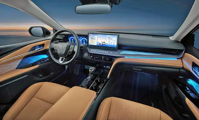
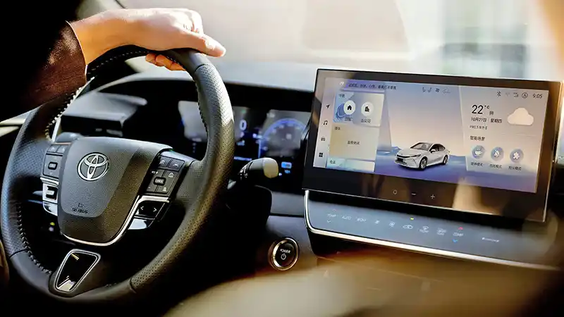
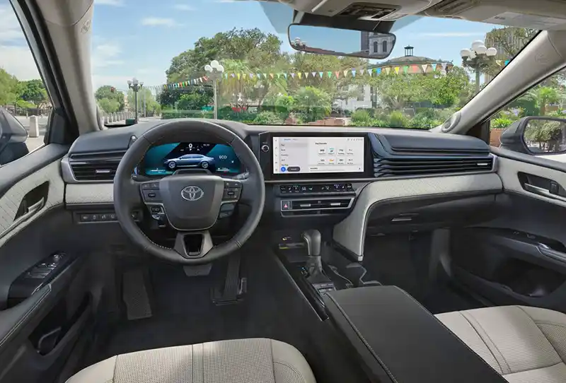
2025 Toyota Camry interior.
Last Updated:


Yes, that is the new interior of the 2025 Toyota Camry. But not the one we are getting here in North America, this is the interior of the Chinese market version, and it already seems much more upscale and modern than ours.
I saw the 2025 Camry in person at the Auto Show just a couple of months ago and wasn’t impressed. The 2025 version is basically a mid-cycle facelift and not a new generation. But at least, the interior seems all new. Although a bit blocky in a weird almost “brutalist” style, it does look new and different, for sure, but not necessarily great.
The Chinese market interior looks a lot more refined. Especially with the redesigned dashboard. Everything seems more elegant and more modern. The row of flush buttons on the dash under the screen is particularly impressive and classy looking. All in a more subtle way. While the “in your face” dashboard design of our version seems almost crude by comparison. What is hard to see in the 3rd photo, is the acres of shiny black plastics on the US dash.
I wonder why they spent the money and effort to design 2 completely different dashboards since I really think the Chinese market one would have worked here very well.
Which one do you prefer?

A shame that all these manufacturers think it’s ok to deprive the US market of better design engineering and equipment content in comparison to certain other markets. The Chinese Camry interior design is way better imo.
These appear to be the exact same interior with different glare, lighting and angles.
Vince – I agree that the row of flush buttons under the screen looks more modern and upscale. However, I am not in agreement about the placement of the screen. I am just not a fan of iPad-like screens that stick out above the dashboard. The U.S. screen is integrated well and flows with the horizontal design of the rest of the dash.
The Chinese one will be the new Lexus ES interior – just a guess
Replace the screen & touch “buttons” with the new interior screen on new Lexus models from 22 and on
Replace the shifter with the electronic unit found in Lexus models that have received an update since 22
Done. ES 350 interior
It’s even shown in a Lexus interior color, Palomino
Gain ground in China with nice interior for the segment
Keep the differentiation in models for the US. No wasted time or resources on design
A couple thoughts… the poster above noted the Lexus interior. If I’m correct, the Chinese haven’t been purchasing the Japanese brands because they’re behind on tech and more expensive. A Lexus interior would make sense if it costs more already. Here, Toyota is a basic (very basic) brand.
Also, I am OK with NOT having a ton of these tacked on screens that control everything. I still have a daily beater a 2012 Civic, that’s been bulletproof. But what I love about it is the two tier dash, with digital speedo and integrated info display. If Honda did something more like that with digital screens, you wouldn’t need a heads-up display.
I think the Chinese dash is aesthetically better, however, purely on a practical level the U.S. version is probably superior because of the usage of physical buttons. The haptic feedback buttons being used in the Chinese version are notoriously bad at distracting drivers due to their impreciseness.
The Chinese version looks to have those haptic buttons and no volume knob, that I thought most auto reviewer HATE. I’ve never liked Toyota’s interiors, but the Camry looks like it is going to share the Crown’s interior. Otherwise, a non-starter.