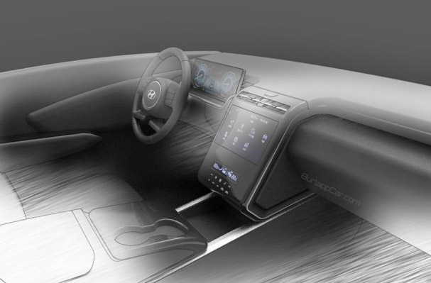
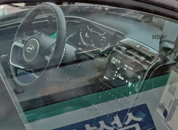
2021 Hyundai Tucson interior teaser: no tablet!
Last Updated:
The new teaser sketch from Hyundai is probably a slightly simplified version of the new interior.
While the second photo from a prototype probably doesn’t show the final trims and textures.
Still, this is already looking great. This is exactly how a center screen should be positioned.
Not an afterthought like in the 2021 Camry. Or many other cars these days. The designers actually came up with an elegant and original way to include it in the general design.
The next generation Tucson could very well become a huge hit for Hyundai. The current generation is doing OK. But with just under 138 000 of them sold last year, it really is no match for the Honda CR-V and Toyota RAV-4. (With yearly sales of over 380 000 and almost 450 000 for the Toyota!)
I think the next Tucson could become one of the major players. And also spell trouble for the all-new Nissan Rogue.
What do you think?
Could this become the huge hit Hyundai needs to compete with Toyota and Honda?


I wish all the automakers would at least try to shroud these touch screens. If they want us to rely on screens for everything, we have to be able to see them!
LMAO @ "trouble for the Nissan Rogue". Wow Vince, the Nissan hate is strong with that comment. You do realize the current Rogue sold over 350,000 copies in 2019 right? The new Rogue is surely going to increase that number, perhaps back over 400,000 even. The Tuscon has a long way to go to catch up in the sales race with the big 3. The new Rogue, CR-V and RAV-4 are going to eat this thing for breakfast.
Here's hoping that U.S. models aren't ALL touch capacitive and there are actually some physical buttons. I'm looking forward to the next Tucson, but it will definitely be off my list for possible next vehicles if there are no physical buttons, including a volume knob.
This looks great, very clean and modern. Just two things:
1. I hope they the screens offer high resolution and are anti-glare as there is no shading.
2. I hope Hyundai offers better colours for the interior, the all black everywhere look of the current model is really cheap looking. But given the other products they've recently launched I'm sure that will be addressed.
Looking forward to seeing it, any idea when it's launching?
A+ on the center console infotainment stack! Look very luxurious! Tucson is going to take away a lot buyers from RAV-4, Escape and CR-V.
Tablet works better for no distractions, while driving. Vince is just obsessed with tablets. In reality they work.
"Vince is obsessed with tablets'", because "Vince" has been driving many cars with them.
It's just from actual driving experience. With many different cars. And they always suck. No matter what, they are always a distraction. There is nothing worst at night than a cheap-looking tablet sticking out. And yes, they do have a night mode. Which is also a distraction. Since they are always on no matter what.
And that is on top of being ugly. There is really nothing wrong with an elegant, integrated screen. The tablet look will be seen as a joke in a few years. (Just like these late 80's GM cars with almost 100 buttons on the steering wheels.)
My own car has a screen that is very well integrated into the dashboard. So it is just a few inches lower than the tablets. And it works great.
I don't think anyone ever has a problem looking slightly down an inch or two. People have been doing this for decades.
Even most cars with tablets have switched bellow them.
Vince what do you mean by "And yes, they do have a night mode. Which is also a distraction. Since they are always on no matter what."
There's literally a setting/button on almost all modern vehicles that completely shuts off the infotainment screen for the exact reason you complain about them so much during night driving. That's quite the opposite of "always on no matter what."
I agree that from what we've seen, Tucson will be one of the best lookers in the segment.. and hopefully this interior will be shared by the Santa Cruz.
I see what you mean about turning the entertainment screen off. (Although not sure ALL cars have that)
But that also means you have zero access to anything. Music, map, phone, AC (in many cases). The point of these screens is not to turn them off since they are now controlling almost everything in the car.
In the Tesla Model 3 and Y, they ARE controlling everything…
This will be a hit. We saw the actual truck in Korea and it is the next exterior design evolution for Hyundai as well which are sharp angular lines that work. Very impressive and this interior will be on all the future redesigns.
Vince: Most cars allow you to control music, have have, etc via steering wheel controls and the screens in the gauge cluster nowadays. If you need navigation on the main screen, then you’re not “distracted” by the tablet screen because you’re actually using it/looking at it for a reason. Also, most vehicles still have separate HVAC controls below the screen, so you control the AC from there. Tesla is another story…their one screen solution is awful for many reasons, but that is generally limited to one brand.
*have nav, whoops
Vince, I have an A5 and the tablet works fine day or night. I am not sure how your personal eye problems translate to blanket statements for everyone else. If the interaction is cumbersome because of poor design that would be true for either a tablet or the dash. But a well designed tablet and it’s position are just fineFor driving. So you are speaking for yourself.
Where is the volume knob?
I think this car will look great but it won't affect much Toyota's, Honda's, and/or Nissan's sales. A lot of people still see Hyundai as a subpar brand and won't even bother to go check this out.
Glad Hyundai has proven not to just follow the trend when it comes to all aspects of design engineering. This is looking great. I might even get over those squared off wheel arches by the time it is introduced. The best thing about Hyundai though, is, like Mazda, no CVTs. Hopefully they continue this on the Tuscon.
My Grand Cherokee has its screen in the dash, which is just fine for the 99% of the time that I’m driving In familiar territory and don’t bother with nav at all. It’s usually set to show what’s on the radio or streaming through my phone and I rarely need to look at it.
But on a month long 3000 mile road trip around the South last year, our rental Altima had a tablet on top, the kind Vince hates. And I loved it. It was super easy to see while driving which is a life saver when using GPS every day, particularly in urban traffic.
Whatever you think of how it looks, for someone who needs to use nav on a regular basis, that high mounted tablet style screen can be a real plus.
Turns out this isn’t from Hyundai. It was made by someone based on the spy pics. Seems pretty accurate, but not actually from Hyundai.
I'm sorry Vince… You're just wrong on the tablet thing.
My car is 2015 Mazda 3. I sheepishly admit that I bought it mostly because at the time it was the cheapest car that had the tablet screen and BMW-like controller- and have never regretted it! The screen is half touch screen (only touch when the car is stopped) but I have NEVER felt the need to use the touch screen. The controller wheel works amazingly – better than any other system ive used in other cars. The tablet type screen works so well because of its positioning. I honestly don't understand why it is distracting for you. YEs you can dim it and easily turn it off as others have said – but I have never felt the need to do that.
This week I am driving a Kia Sorento rental (not the new one) I am stunned at how inconvenient the dash-incorporated nav screen is. It is soooooo low, and I have to take my eyes off the road for far longer to see anything on the screen – it is simply awful and I cant wait to get back to my tablet that is within my line of vision.
It seems this is the horse you are willing to die on though. And fair enough – every person has there own design style. But please – when you endlessly complain about tablets, emphasize that you don't like the way they visually look instead of claiming that they are distracting to everyone. MAybe they distract you (for some unknown reason) but as made clear in these comments, most people like the placement of them – hence why all automakers are using them. Toyota would not spend the money to redesign the dash of the camry if it did not benefit the experience. (and I admit – the previous version had a beautifully integrated screen which looked better)
You forgot to a mention Nissan sells a good portion of the Rogue's figures are thanks to rental fleets, they're not selling on their own…