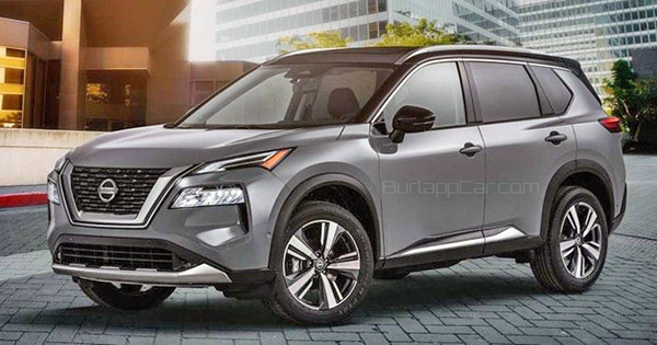
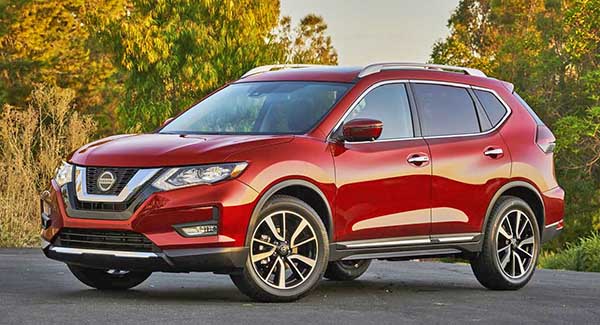
2021 Nissan Rogue Vs. the current one.
Last Updated:
Quite an amazing move for Nissan. Which just decided to strip the new Rogue of all personality.
I think the current model always looked fine. And it still does.
It is an OK drive (the old 2.5 Liter and CVT has never been that great)
But tons of people like the way it looks.
The new one has none of that friendly personality. It has become as generic as a crossover design can be. It now seems that anything else in the segment looks better. This is really too bad for Nissan. As they really needed a hit right now.
As I mentioned earlier, the 2.5 Liter/CVT combo is OK. It is not as bad as many people say. (If you never push it)
But it is getting quite old. Other offerings are better, smoother, and more powerful.
And, unfortunately, Nissan is rumored to be using that same old combo in the new one.
Let’s hope maybe the new 2.0 Turbo from the Altima could be offered as an option.
With the Altima, Versa and Sentra, Nissan has come up with pretty nice new designs. (or basically, one nice design in 3 different sizes)
Let’s just hope the new Pathfinder doesn’t end up looking like a larger version of this Rogue design.
More pictures and official specs of the new Rogue coming up. Very soon!


You’re kidding yourself if you think the current generation, or the first generation, had ANY personality. The Rogue has always been a generic vanilla crossover; this is at least an incremental step in the right direction.
I think the exterior is an improvement, but just barely. As I said before though, the interior is a big improvement. Now if they would just get rid of that damn CVT.
After the Cherokee (and way before it the Aztek) did the split lights thing with the markers/DRL up high and the headlights low, numerous others have followed in recent years (Hyundai, Chevy, etc.). For the most part, the later attempts have been largely successful, but this new Rogue blew it and made the same mistake as the pre-facelift Cherokee – no focal point.
The two lighting elements are too similar in size for either to be dominant. At the same time they are too far apart to hold together as one unit. So, you don't know where to look and the "face" doesn't quickly lock in. The visual confusion clutters the identity and doesn't make a great impression. Jeep ended up smoking the covers on the lower lights to make them less prominent and clarify the Cherokee face a bit. We'll see if Nissan fixes this along the way as well.
Vince definitely has it backwards. Until now the Rogue has always been pretty generic looking. This new design is a step in the right direction. I’m not a fan of split light designs and don’t love the front end on this new one, but the side profile and rear look pretty good. Has anyone else noticed the design cues for the exterior are lifted from the X-Motion concept a few years back? In that design the front headlights were slim units and connected in a V shape. It was very cool looking and it’s a shame that design couldn’t transfer over to production. The interior is a step above for sure. Light years ahead of the current version and in step with what Nissan did to Sentra and Altima interiors. Hopefully the drive improves with this new model and Nissan adds more power. It’s almost 9am ET where I am so soon all will be revealed and we will know a lot more about this new Rogue.
Yeah, we can bitch and moan about how bland this Karenmobile is, but, at the end of the day, it will still sell like hot cakes. It's innofensive, anonymous and, hopefully, reliable. Which is what most soccermoms and brainless millennials want in a car. As long as they use the absurd profit this thing will generate to build a new Z, i'm OK with it.
The only reason anyone picked the Rogue over the competition was that Nissan put more $ on the hood. Take away those cheap leases and 0% interest gazillion month loans (as Nissan claims they will) and sales of this thing are gonna skid big time, AWD or not.
Rogue is light years ahead of rav4 and crv in terms of ride quality and road noise