2025 Ford Expedition.
Last Updated:
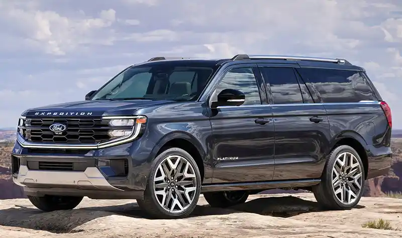
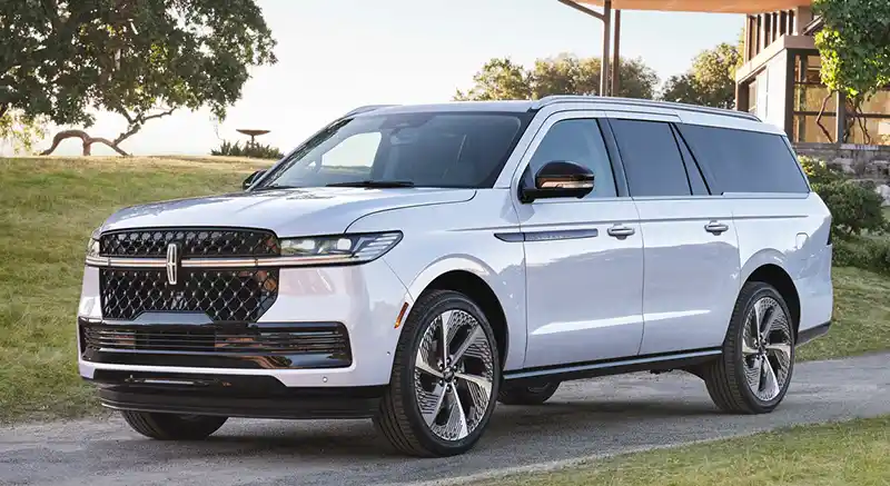
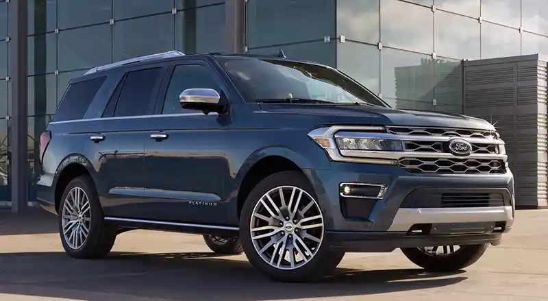
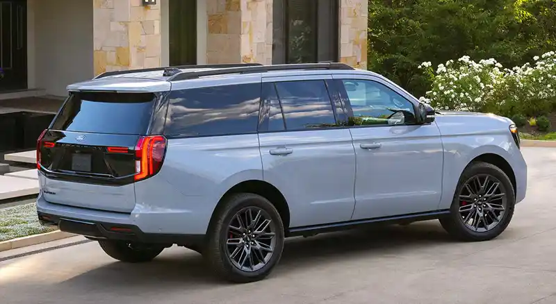
As expected after seeing the 2025 Lincoln Navigator a few days ago, the revised Ford Expeditions out.
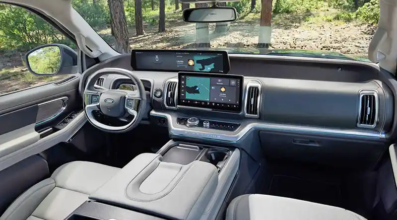
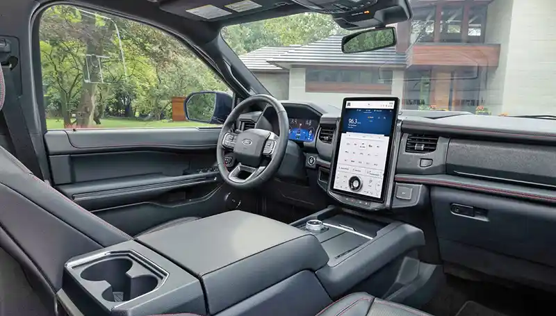
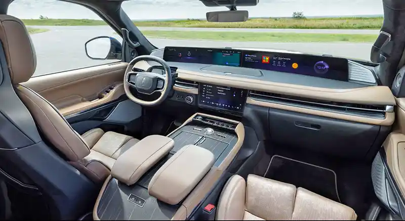
And looks like a cross between last year’s Ford Expedition and this year’s Navigator. I guess GM does the same thing with their giant truck-based SUVs as well. Although I really think the Cadillac Escalade does look more different from the Chevrolet Tahoe outside. Inside is where both luxury brands try to make sure your extra dollars spent don’t go unnoticed. The interior of the new Ford Expedition is not at all similar to the 2025 Lincoln. However, I wouldn’t really call it an improvement either.
The previous interior had a screen similar to the Ford Mustang Mach-E. Which I guess was Ford‘s most modern interior a few years ago. I think the new one is quite a mess.
The screen right in front of the driver is way too wide if you’re going to have yet another separate widescreen on top of the console. It just looks odd and unnecessary. The whole thing looks like a series of afterthoughts and not a cohesive design at all. Something I guess doesn’t really matter to the expedited audience…
You know get the same Split Tailgate introduced in the 2025 Navigator. Powertrains as the same as before, with a 3.5 Liter Turbo V6 with 400HP. Or a 440HP version of that same engine.
At almost $62,000 to start, the 2025 Ford Expedition is about $6000 more than the 2024 model. That’s also about $6000 more than the base Chevrolet Tahoe. it’s also more than the new 2025 Nissan Armada.

The comparison photos make the Navigator look even less more Upscale.
I was pleasantly surprised by the ’24 Expedition having rented a couple of them recently and driving them through CA and NC.. big, comfortable, great long distance vehicles for large groups. Even on the ’24 the ergonomics were messy, lots of buttons everywhere, and my absolute pet peeve +/- gear shift buttons somewhere on the dash or near the rotary gear shift (why not paddle shift behind the steering wheel?)
I see the ’25 is worse.. they went to some sort of touch screen interface on the steering wheel instead of the many buttons that for, better or worse, were functional once you figured out what they did and could use them without looking down or at a screen.
the double screen on the ’25 Expedition makes no sense (same as Navigator).. why have 2 different areas of focus for the driver, one screen somewhat in front of you, the other one closer to you but outside your line of sight. A driver will keep having to shift focus from the road, to the front screen to the middle screen, etc. Good luck with the older generation whose eyesight is not so great, this seems like a huge issue for me.
The squared off steering wheel is necessary so the driver can see the front screen ABOVE the steering no longer through it… overall it seems like a LOT of wasted space in this huge vehicle and questionable ergonomics.
on the outside, the Ford is looking more and more like a GMC. I think the ’25 is an improvement over the ’25.. a bit less on the rear view, however, I don’t mind the split tailgate…
it would be great to see a comparison of these large land yachts: expedition vs suburban vs wagoner and their luxury cousins Yukon Denali, Escalade, Navigator, Grand Wagoner… and throw in the Toyota/Lexus and Nissan/Infinity pairs into the mix
in a weird way, these are the modern versions of the 1960s and 1970s American station wagons. HUGE land yachts, comfortable, room for 7 or 8.. not particularly economical or ergonomically sound. Lots of American luxury, wood leather.. nowadays lots of tech as evidenced by the proliferation of screens
to a non-car person, they are indistinguishable from one another, esp when you thrown in the Suburban/Yukon/Wagoneer etc.