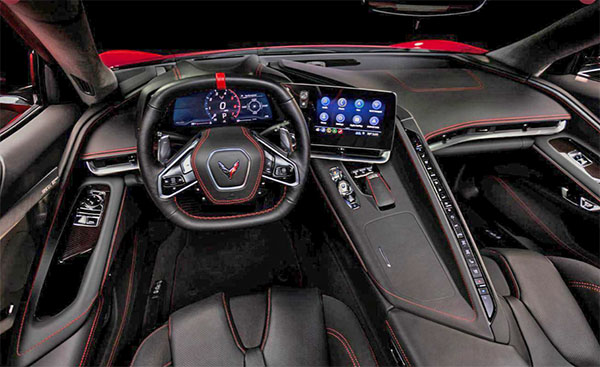
2020 Chevrolet Corvette Interior
Last Updated:
Not exactly sure what to think about this.
The red stitching is almost becoming ridiculous these days. It seems to be in everything that is marketed as “sporty”.
Otherwise, this could be described by some as a mess.
That long row of switches/buttons on the right of the console is really odd.
More than actually stylish.
The passenger seat looks like a horrible place to be…
So far, I see a huge amount of lines, bits, and pieces that don’t really fit together.
Of course, we” have to wait for more pictures.
But it doesn’t look like the 2020 Corvette will be a class act…
We will see the whole thing is just a few hours so stay tuned.


That looks stellar. I don't know what interior you're looking at Vince…
Really nice drive focused layout. The button strip is a lot, but I love how bold it is aesthetically. Also a very nice dash+screen implementation (waiting for the comments about "glued on ipad" to show up…). Sexy two spoke wheel as well.
Couldn't care less about the stitching. I'm sure there'll be plethora of color options. Go all black if you wish…
Center console looks a little bit high for accessing drink bins.
The steering wheel and the long row of switches/buttons on the right of the console is way over done.
There are like 30 buttons, you will hit a tree by trying to figure out which one turns on the headlamps.
As long as the lower door panels are soft and pretty, the rest doesn't matter.
You can forget about manspreading in this car, so I hope the seat coolers are effective. The stitching would look better if the seats were all or mostly red.
There's a photo at GMA showing light tan stitching on a black wheel hub and a similar headliner.
Train wreck of an interior. Looks confirming and punishing for the passenger. That row of buttons is ridiculous.