2014 Toyota Land Cruiser: Even worse than the Lexus GX
Last Updated:
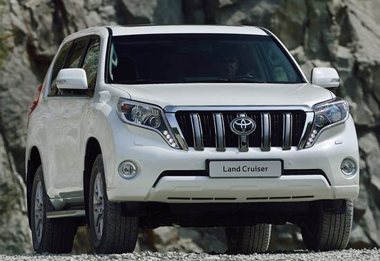
Just when you thought the new grille on the revised 2014 GX was bad. This comes out.
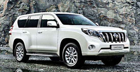
The Toyota version. (Sold overseas as the land Cruiser).
This has to be the worse, most offensive, vulgar looking front end ever designed.
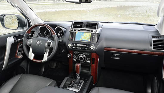
As for the interior. It is pretty much the same as the Lexus, minus the assy looking fake metal trim. So it’s actually about 3% better…
Atrocious. Inside and out.
Panned and failed.
scary boo!
looks like they bought the guy who designed the Mahindra pick up trucks…
Wholly cow! How atrocious. Glad I spied this while on the turlet.
I could actually see this design being fine on the streets of Tokyo or Hong Kong. But in Western countries, it will be considered unrefined and messy. Different tastes completely. Personally, I think that Toyota is lost, and living temporarily on its past glory.
This and the Lexus version are just absolutely pathetic!
This design study showed they still know how to do "Ugly."
It's bottom dentures fell off, and the designer kicked them under the vehicle, hoping nobody would notice. None of the Toyota execs did. Again.
Indians would love this design
What do u mean by Indians???
Atrocious. Ridiculous. Typical Toyota.
After looking at the pictures some more, I want to say that Toyota should rename this Land Shark. The problem is I've never seen a shark with superfluous haunches and a bucktoothed overbite.