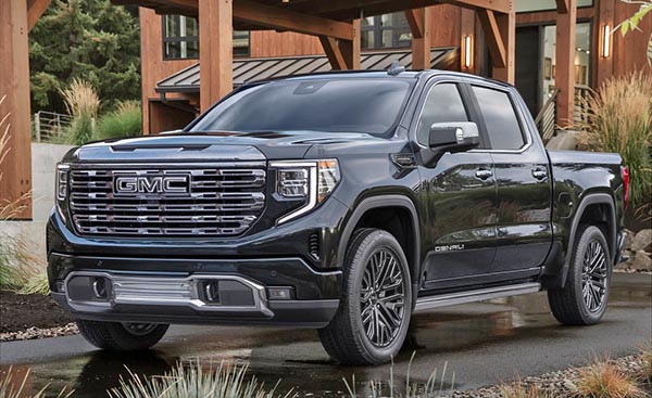
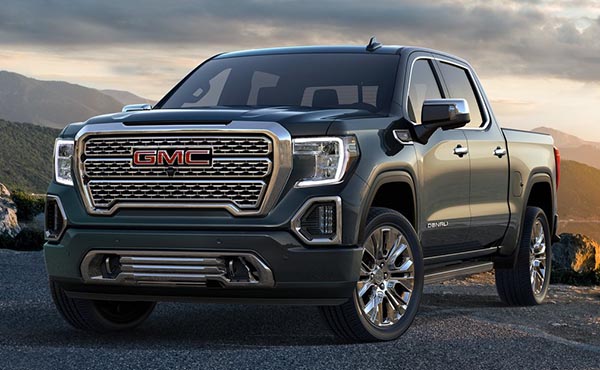
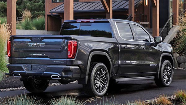
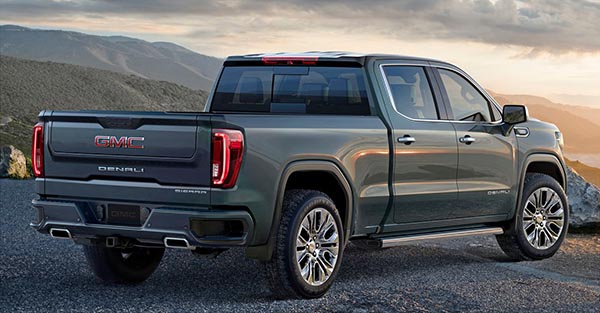
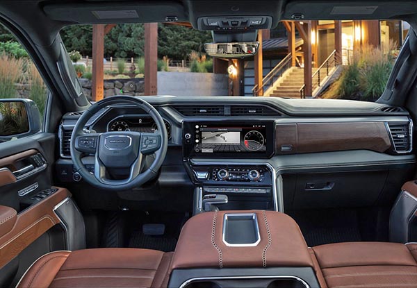
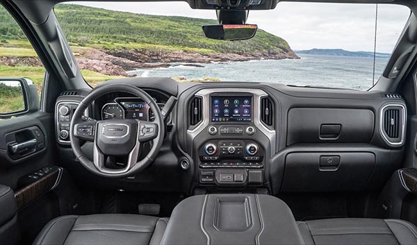
2022 GMC Sierra Denali: quite an improvement…
Last Updated:
Just like what we just saw with the 2022 Chevrolet Silverado, this is a choking improvement.
The “still huge” grille does look much more integrated into the rest of the design. And it also looks 1000 better than the ghastly front end of the new 2022 Toyota Tundra.
Like the Chevrolet, inside is where it looks like a brand new generation (it’s not). Even the door panels are new. And the whole thing looks really good. Just look how bad the current interior looks next to the new one. Great job!
On top of everything, that 3.0 Liter diesel option is just fantastic…
agree, the interior a massive improvement over the previous generation. I can't believe I'm saying this, but the column shifter makes more sense than the console mounted one.. always used to think the column shifters were "old fashioned" but they actually work well and are easy to understand (up for park, down for drive) and free up console space…
the exterior is another thing, huge chrome grille (to go along with the huge belt buckle?) they even restyled the rear a bit (why?)… the rear bumper step inserts are shorter, possibly less useful
what GM needs is a hybrid in this body style… Ford has V6 Turbo, V6 Turbo Hybrid and all electric…
The biggest improvement is that they got rid of the useless $0.49 wire antenna from the '70s.
My neighbor just got one of these which he parks on the street. While the front end is huge it’s also bad ass which I’m sure is what they were gong for. I’ll withhold judgment on the new front until I see if it’s as intimidating as the current model.
The interior looks to be as big a step up as what it takes to get into one of these behemoths. Kind of reminds me of my Audi, which is not surprising since there’s no penalty for copying another’s work in the school of auto design.
why exactly are the trucks' front ends so huge nowadays? is it only styling, e.g. make it look "trucky" or something else? why not have a smaller, tapered, more aerodynamic front end with better vision from the cockpit. Does the front of the hood HAVE TO be that tall… look at the Sierra, new Toyota, etc.
Very nice.
If Toyota was smart, they would look to GMC and Chevy to learn a lesson or two or more.
Excellent job GMC!
Still a brick wall/billboard face that is growing more and more ridiculous.
Cartoonish and heavy styling outside. Inside looks cleaner and a heck of a lot better organized. Who really needs to drive around such a monster? I thought we were past this small dick phase back when the Hummers became a laughingstock and symbol of waste.
The front is a huge improvement.. leave the bucktooth fang grilles to Lincoln.