2024 Ford Mustang: base interior…
Last Updated:
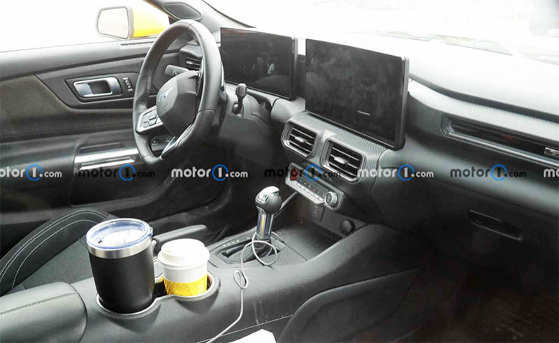
I’ve posted a photo of the redesigned 2024 Mustang interior before. While most models will have the double screen setup, the base model will get this cheap-looking arrangement with 2 separate screens.
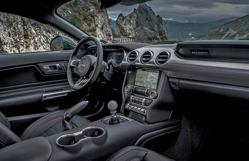
It looks super cheap, and not all new. When you compare it to the current model, you can see how similar the door panels and console are to the current generation. Obviously not an all-new generation. More like the 2010 model was compared to the “really all-new 2006.
The “new” interior in general still looks terrible to me. At least the current one is trying to look like a “Mustang interior”. The dashboard scoops are totally gone for 2024. Making this mess look like anything from anyone. This is a completely disjointed design. Although I never really liked the current interior, I think it’s still much better than what’s coming. mean, this is really bad.
The 2024 Mustang was at the Los Angeles Auto Show last November. At least on the press day, it seems no one was interested. I have to say, I wasn’t either. It just doesn’t look really new. I think once they sell a bunch of them to rental car companies, I think sales will tank. Especially once the new Dodge Challenger EV comes out. That one had a crowd around it at the Auto Show. And it looks fantastic in person! Chevrolet is also working on an EV Camaro. Not just the SUV and maybe the sedan, but the coupe and convertible as well.
That poor Mustang will have a very hard time starting in a couple of years…
It looks like a cheap hard plastic dash with 2 ipads laying horizontal on top. I truly never realized how bad it was, or how much better the current generation was in comparison. Not to mention the reused content. This is really kind of inexcusable by Ford.
My thoughts exactly. Shame on them.
I don’t understand why they chose to have 2 separate tablets instead of embedding them into a single case covering both of them. Plenty of other automakers do this, look at the KIA Sportage for example. That gap between the screens makes it look cheap, like they were an afterthought
I do have to say, as rental cars, the Mustangs are AMAZING!
This is absolutely horrible. Period. I would say Ford should be assumed, but this is Ford.
I am SO disappointed. I was really looking forward to a new Mustang interior (the current one is awful). But you’re right, Vince. This is even worse.
How could you do this to such an icon, Ford?
And when it doesn’t sell, they will have no idea why. But, hey!!!! They are teaming up with Red Bull Racing in Formula One to the tune of millions and millions per year for what is essentially a Ford Sticker on the cars. While they sell “Sporty” like this. The RB team up is few years down the road, but shows where their priorities are. “Sell the rubes on the idea of being cutting edge”.
This is lazy design/engineering at its best. The screens appears to have been thrown in there at the last minutes accented by miles of cheap looking black/gray plastic. What garbage….
Looks terrible. Reminds me of something from the 90s but with 2 tablets tacked on.