2020 Ford Explorer
Last Updated:
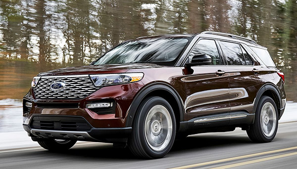
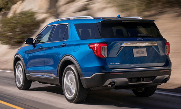
I think Ford did a great job with the all-new Explorer for 2020.
It has the really nice proportions of the new Lincoln Aviator.
And basically, it looks like they tried to adapt the previous design to the new platform, which works quite well.
As it looks like a more athletic version of the current one.
I also like the front end of the Explorer better than the Lincoln big mouthy/chromy grille.
The one on the Ford seems much better integrated to the rest of the design.
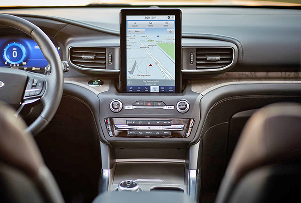
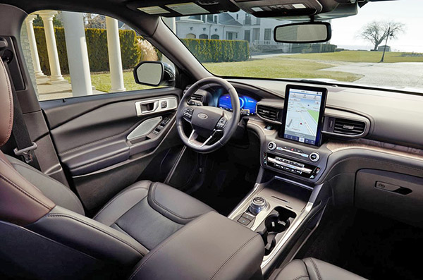
The interior is a mixed bag for me. Since it does have one of the worst version of the laziest interior design element. That tablet really looks like someone put an iPad on the dash. It is not integrated with the rest of the design at all. It just shows zero effort.
But, at the same time, the size and placement will actually be super convenient for most people.
And that wood trim on the dash doesn’t really look upscale. (The way it meets the console is rather clumsy)
But for what it is (a family car), I think it works. It seems much nicer than the Toyota Highlander.
Much more modern than the Honda Pilot.
I think this will be quite a hit for Ford in the next few years…

"I also like the front end of the Explorer better than the Lincoln big mouthy/chromy grille.
The one on the Ford seems much better integrated to the rest of the design."
Except for how the lower grille meets the lower inner edge of the highlights. That's the opposite of well integrated.
"That tablet really looks like someone put an iPod on the dash."
You mean iPad…?
I see what you mean about the lower edge of the "highlights".
And yes, I obviously meant "iPad"…
You are missing the point on the tablet. It is shaped to be used as a cellphone interchange with Apple Car Play and Android Car Play. Screen duplication will look realistic for a change. Your phone screen will now be appropriately replicated. Yes, it may look odd at first, but this will be of great use – and less distraction while driving. Nice move Ford!
Lol whoops, definitely meant headlights. My bad.
The taillights are a total and complete downer.
I have to hand it to Ford, they continue to improve their designs and this is yet another example. Considering their recent interiors and dashboards (the multi-level, overly designed, 400 button versions) this is the most refrained and efficient design yet. And I think the vertical iPad is a welcome new addition. Technically, we are all more used to this orientation thanks to every smart device we use. I think they are on to something here.
In regards to the vertical screen, it functionality vs. looks! Tesla S owners like their 13” screen so I think you have to use it and preception will change!
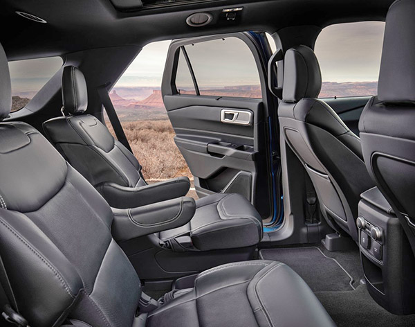
I hope the stretched wheelbase fixes the crappy second row legroom issue.
That tablet is HORRIBLE and this is the first time that I will say that I would like a smaller sized display in a car. Now, that is either the top of the line or an option, in this spy pic we can see a smaller tablet, which in my opinion, looks better:
https://www.carscoops.com/wp-content/uploads/2018/12/e05f9f79-2020-ford-explorer-spy-shots-0.jpg