Auto Show notes: Hyundai Ioniq 5…
Last Updated:
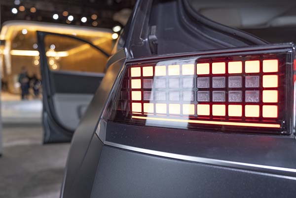
I was really eager to see the new Hyundai Ioniq 5 in person.
As this retro-futuristic “Giugiaro-like” 80’s design is one of my current favorites.
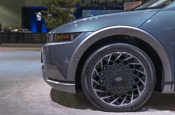
And the Ioniq 5 does not disappoint in person. It just looks great from any angle. Although I have to say, things would be even better without the wheel arches. They just don’t belong there…
But I guess that’s how the marketing suits get to call it an SUV for some reason.
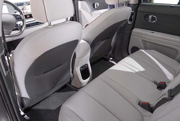
Just like everyone has said before, it has a huge interior. Everything looks great and is very high quality.
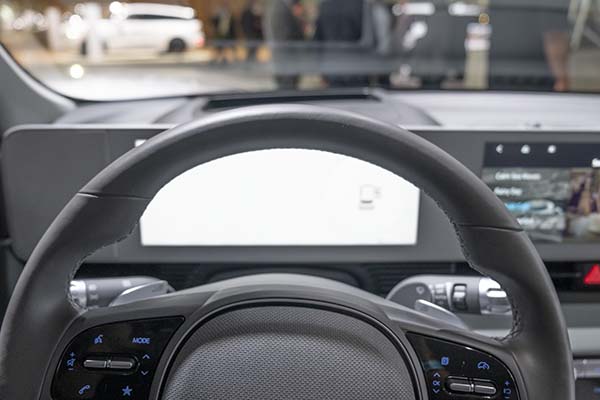
But I noticed that the steering wheel was actually blocking parts of the screen. The photo was taken after I adjusted everything to my driving position. And the camera right in front of my eyes.
I never noticed that before in other cars. (The Kia EV6 does it a bit too)
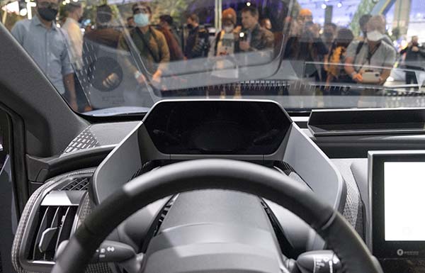
The photo above is the same driving position in the new Toyota b4 WXZTWZ EV. And I think their screen position is actually far better than just right behind the wheel.
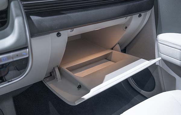
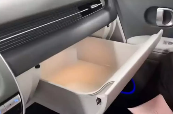
Another weirdness is the glove compartment. In so many videos from Europe and Korea, they show the really cool drawer-like glove box. (Above pic)
Instead, the US market Ioniq 5 gets a regular old fashion opening. And it is also much smaller.
Why???
Is there some weird “Glovebox regulation” I am not aware of? This is really too bad.
I also noticed the driving position is almost Minivan-like. With no real center console or separation between the front seats. Which is something I am not used to.
For that reason, and some others, I actually like the EV6 interior better.
I really hope Hyundai can keep the price starting at around $40 000. (The Toyota will start at around $37 000) I know Hyundai and Kia have a 300 miles range, but the $46 000 from the Aryia would be too much.
They have a great product and need to price it aggressively.
I really think these two can take some sales away from Tesla.

They would definitely get my money over Tesla. Over anything VW builds as well.
I wonder if the Toyota b4 will cause eye strain due to the instrument cluster and touchscreen being located at considerably different distances from the driver.
Unfortunately, the rectangle screen in front of a round steering wheel combination is very popular now, but I don't think they thought this thru fully. The tesla yoke would solve the problem, but I don't think I'm down with a yoke that needs to be turned several times for tight turns. They just need to put a curved screen under a traditional curved binnacle. Right now they are trying to cram a square peg into a round hole, visually speaking.
Other than the instrumentation, which I could get used to, this thing would be on my short list. Very nice.
Get a yoke wheel with one of those 1950s era "turning ball" (I don't know the name of it).
The screen situation is not as bad, mainly because that big screen is… pointless. There is nothing to see. At least on the sides. The center part has all the main info, but on the sides there is just some fancy graphics. I wish they would let users to actually modify the layout.
I would love to have only speed and range clearly visible. Everything else is unnecessary.
Also i find the drive selector quite odd. Simple buttons on dashboard would be enough.
Heres some pic of the euro version. Sorry, didn't check the glovebox situation… https://www.flickr.com/photos/janitors/sets/72157720128259608/