Auto Show notes: Lincoln Aviator
Last Updated:
Most people seem to really like the all-new Aviator.
I think it is a big step for Lincoln and will be quite popular.
But after sitting in one, I am not crazy about it at all.
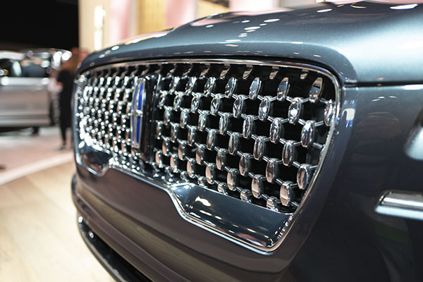
First, I still cannot get used to that super chromy grille. I guess this is a trend now, but to me, this is just plain vulgar…
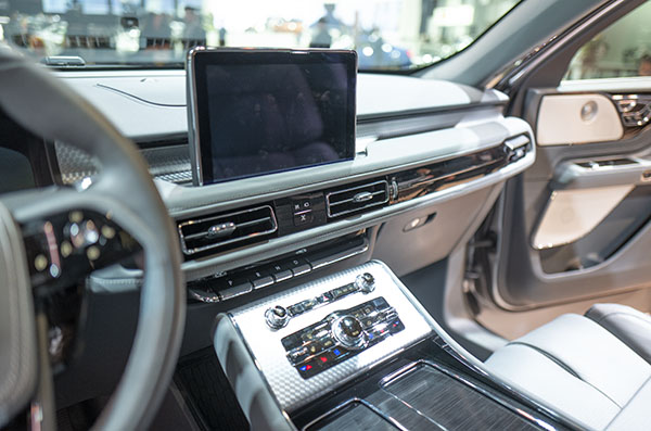
I know I always complain about tablet screens. But this is the worst offender I have seen in years.
As it completely looks like an afterthought. It is also surrounded by some super cheap looking plastic chrome.
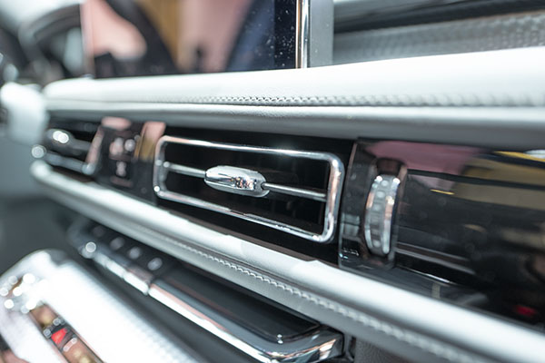
In general, the interior is just way too shiny. Just like in the Continental, every shape seems to be accentuated by a cheap plastic chrome trim.
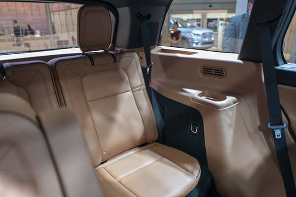
The third-row seat looked quite comfortable.
The door panel design is really nice. (it looks like they whoever designed it wasn’t such a fan of chrome everywhere)
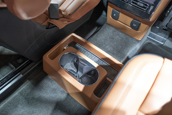
The specific model at the auto show had a super cheap looking low console between the rear seat (2nd row)
Not the full console seen on Lincoln’s official pictures.
(This reminded me of this cheapo van accessory you could find at Pep Boys years ago. )
As I was sitting in the Aviator (taking these pictures), some Lincoln/Ford execs were inspecting the car with a woman from China, also working for Lincoln. She was going through every detail of the interior, explaining to them what they would have to change for the Chinese market.
She told them the console design was too simple. It needed a shifter “or something”.
Explaining that Chinese customers don’t like “empty spaces”.
She wanted even more details everywhere.
I understood where this trend for bigger grilles, more lines, more chrome everywhere came from…
As the Chinese market is now the largest for US manufacturers, designers have to cater to Chinese taste.
Something we all pretty much know by now. But it was really interesting to “see it in action”…



Plastic is plastic! Most cars are plastic body parts especially front and rear ends. Interior is also mostly plastic too! Vinyl is plastic too! Synethic leather is plastic too! Controls are plastics too.
It must be infuriating for the folks at Lincoln to get this kind of criticism. Clearly they put a ton of heart and effort into this. But still, it's only 7/8th's where it needs to be to be a serious competitor in the luxury space. The "chrome" needs to be matte, and not fake looking glossy chrome. That console sitting on the floor is laughable.
I believe that small console in the back is an option to allow for more of a walk-through space for the third row seats. If you have a ton of kids who are always in those seats and move around on road trips, it probably makes sense.
The larger, regular console is a better bet if the third row just sees occasional use.
The Black Label Aviators are the true step up to match the German luxury, Volvo and Range Rover models.
It occurred to me just now that one reason tabletstuckondash is the trend is so a larger one can be used in future years without having to redesign the entire dashboard. Replacement is also easier.
Aside from the ugliness, it looks flimsy to me, like the hollow cheap plastic dash boards of the 70's.
Despite any shortcomings, the Aviator is still better looking than 99.9% of the SUVs on the market.
At the price point of the new Aviator, that floor mounted console is inexcusable. I was actually liking the new Aviator alot, until you mentioned all the plastic chrome trim. I can only imagine what that will look like after a few years of good wear and tear.
Who cares about all that plastic? More cowbell!